As a rule, user interfaces, whether for mobile or desktop apps, encompass a significant amount of visual media (images and videos), necessitating close collaboration among designers and front-end developers. The process for building UIs entails a designer-to-developer handoff, at which the designer transfers to the developer blueprints produced with such tools as Photoshop, InVision, and Sketch. The developer then implements the blueprints with Cascading Style Sheets (CSS).

Between July 29 and August 3, the Google Developer Student Community of the University of Lagos, Nigeria participated in a week-long hackathon called Open Hack Week (OHW). Sponsored by Cloudinary, Interswitch, the Ogundipe Foundation, and other notable organizations, OHW comprised 14 teams, five developers each. After six days of brainstorming and coding, the teams successfully built the minimum viable products (MVPs) for their projects, which they subsequently presented to all the attendees.
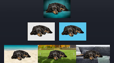
Slow-loading web content and problematic media displays that involve seemingly interminable scrolling tick off users to no end. Compressing online images is, without question, a critical task for spearheading customer retention for websites. Keep in mind that small images can still look sharp. This article shows you how to achieve that by mastering the techniques of compressing images for the web.

Steve Forbes, editor of Forbes Magazine, once said, “Your brand is the single most-important investment you can make in your business”. That bold statement is spot on, especially with respect to digital media. Furthermore, consistency in brand experience is crucial for building trust with users.
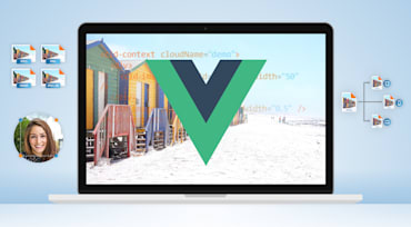
With the advent of technology and the attendant fast-growing demand for feature-rich computing devices (laptops, smartphones, iPads), their manufacturers are rising to the occasion by producing high-resolution machines with screens of various sizes and device-pixel ratios. Thus was born the impetus behind the need for and creation of WordPress responsive images, which automatically optimize their online display according to the size and resolution of the device screen, ensuring sharpness and crispness—a delightful user experience.
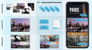
Automating the organization of your website’s media assets (images and videos) saves time and money, boosting the usefulness and lengthening the life span of those assets. Cloudinary’s artificial intelligence (AI) driven automatic tagging, transcription, and moderation capabilities ably and efficiently handle that automation for you—at scale.

Part 1 of this series describes the importance of engendering support from external developers to ensure success of innovative technologies. Part 2 delineates what energizes and inspires developers. Here in part 3, I’ll elaborate on two common mistakes that technology enterprises make when planning strategies for winning over outside developers along with suggestions on how to get prepared.

Typically, with Cloudinary, you want to do two complementary things for a remarkable user experience: save bandwidth and load your site as fast as possible because the smaller the sizes of the resources, the faster your site loads. And it’s been proven time and again that the longer your site takes to load, the smaller the number of visitors who will return. No matter whether you’re a developer or content creator, you will find Cloudinary’s tools that optimize digital media (aka digital assets) simple, intuitive, and effective.

Approximately 250 attendees, mostly from the food-and-beverage sector, attended the Digital Food & Beverage 2019 conference in Austin, Texas on July 15-17. Brands abounded among the participating companies, including Kraft Heinz, Brown-Forman, Coca-Cola, Anheuser-Busch InBev, PespiCo, and Nature’s Bakery. Besides representing Cloudinary at the booth, my three teammates—Alexa, Dave, and Roseann—and I joined numerous interesting meetings and demos, sharing many enlightening conversations with the sponsors, speakers, and attendees.