“Responsive.” Where did that term come from, anyways?
In his sea-changing essay, Responsive Web Design, Ethan Marcotte explained:
Recently, an emergent discipline called “responsive architecture” has begun asking how physical spaces can respond to the presence of people passing through them. Through a combination of embedded robotics and tensile materials, architects are experimenting with art installations and wall structures that bend, flex, and expand as crowds approach them. … rather than creating immutable, unchanging spaces … inhabitant and structure can—and should—mutually influence each other.
This is our way forward.
This is a grand and exciting vision! After establishing the problem he hoped to address – a radically diversifying device landscape – Ethan began to sketch a solution by likening ”responsive“ future-websites to robotic, flexible, massive, and intelligent structures, which can shape-shift before our very eyes, to suit our ever-changing needs. Who wouldn’t want to build the digital version of that?
As we begin our series of investigations into what it means for images to be “responsive,” I want you to spend a moment with that vision – that huge, creative ambition. Relish it, cherish it. And then put it on a shelf, as we enter the world of responsive images through a much more mundane metaphorical portal.
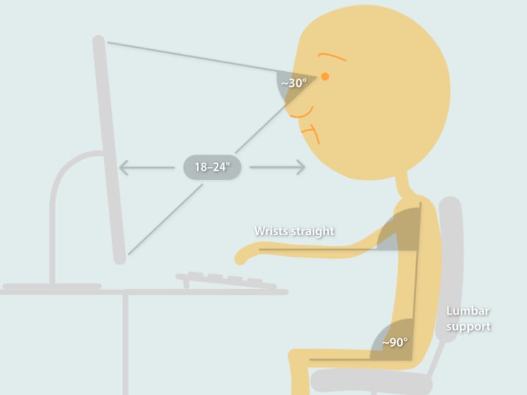
Office chairs
I want to talk about office chairs, but our story starts with cockpits.1 In the 1940s, the United States began making thousands of airplanes. Planes designed using a vast dataset – averaging out servicemens’ measurements to craft the perfect cockpit for the average man.
But as war began, these one-size-fits-all planes began crashing at an alarming rate. A researcher named Gilbert S Daniels figured out why: the “average” cockpit fit almost nobody – less than 5% of pilots, to be exact. In short order, cockpits were made adjustable, so that pilots could ratchet and slide their seat and controls into reach. Crash rates declined, pilots stopped dying, and whole new classes of people (short people! tall people! women!) were able to fly. “Equal fit” led to enormous gains in both performance and opportunity.
Thus, “ergonomics” was born, and after the war the idea that we should imbue mass-produced artifacts with affordances for human diversity spread – all the way to the humble office chair.
Responsive images are like desk chairs. While the idea of creating robotic, shapeshifting spaces appeals, responsive images aren’t as spectacular as all that. Their aims are humble and true: equal fit and ergonomics. Most of the time, responsive images are invisible; as forgettable and indispensable as your chair. Visually “boring,” but in service of goals that are reflective of what’s truly and deeply exciting about creating on the web: improved performance and expanded opportunity.
One size fits nobody
Time was, most browsers ran on on same-ish-sized screens. De-facto “standards” like the 960 grid embraced this uniformity, and encouraged designers to craft fixed-size cockpitslayouts tailored for the average screen. Static layouts on same-y screens meant that sizing images was a snap. One simply had to measure precisely how many pixels an image occupied within a layout and “Save for web” at exactly that size. Every visitor would then receive exactly the same resource, which provided precisely the amount of data that they needed – no more and no less.
Over the past decade, this set of one-size-fits-all practices has become, well, problematic. The web’s reach has expanded beyond 1027×768 monitors, to phones, TVs, e-ink screens, heck, even a few brave smartwatches – hardware of every shape and size. Hi-DPI screens mean that a pixel is no longer a pixel; the gap between low- and high-powered hardware, and the newest and oldest browsers continues to widen; and a new revolution – wide-gamut color on the web, is just over the horizon.
To cope with this ever-growing diversity, the industry has embraced Ethan’s philosophy of Responsive Design. CSS Media Queries made responsive layout possible, but images – whose resources are intrinsically fixed in height, width, color-depth, and content – have been stuck in the fixed, one-size-fits-all past.
Just as single-sized cockpits couldn’t cope with the diversity of human form, single-resource images have failed to accommodate a newly diversified device landscape.
Worst-case scenarios
And they’ve failed spectacularly! You see, we, on the web, haven’t merely targeted an average – we’ve optimized for an extreme. For years, the only way to take advantage of new, high-end hardware – Retina displays, huge monitors – was to craft enormous resources and send those resources to everybody. The result? A slow-motion performance disaster:

Which brings us to the present day. As of this writing, images account for 64% of the total byte-size of the average page. Measured by weight, most of the web is images. Looked at one way, this is a catastrophe – the web’s glorious promise of universal access to information, blighted by 1MB stock photos of people smiling at salads. But in another light, this is catastro-tunity! If we want to make the web faster, images are swollen pieces low-hanging fruit: ripe for the picking.
So: how can we improve image performance?
Fight fire with fire
What do robotic architecture, ergonomic chairs, responsive design and responsive images have in common? All of them:
- …take something static, and make it adaptable; changeable
- …result in products which are more complex than their static predecessors
- …were responses to, and strategies for dealing with, newfound variability in how the product was, or could be used.
In short, they all fight variability with variability.
What sorts of variability are talking about, when it comes to images?
The most obvious sort is variable size. Responsive layouts reshuffle at breakpoints and stretch and squish between them to look good at a wide range of sizes. In 2009, it made total sense to “Save for Web” at the only size your viewers would ever need. In 2016, our images need to be as flexible as our layouts.
Compounding this, our static assumptions about pixels themselves have broken down. High-density (aka “Retina”) displays are legion.
These two, newly variable contexts – flexible layout sizes and a diversity of screen densities – both have the same solution. We need to provide images with variable resolution. We’ll cover this next, in part two of this series.
Variable-resolution images are the most common responsive image use case. But once we’ve opened the door to images whose resources can vary to meet a diversity of contexts, we can do much else besides.
In part three of this series, we’ll explore the disjointed browser format support landscape (which we can address by supplying images with variable formats), and the vast diversity of network speeds (which we can address by dynamically adjusting the amount of lossy compression we apply to our images). Both techniques fall under the umbrella of supplying images with variable compression.
Finally, in part four, we’ll break out of our invisible, ergonomic mode, and think about how we can make our images visually responsive, using a technique called art direction. When we art direct, we vary our images’ actual, visible content in order to tailor them to particular contexts. When we art direct, we’re not just marshaling variability to improve performance; we’re wielding it to solve problems of design.
And there you have it: a high-level overview of what it means for an image to be “responsive.” Responsive images are variable, dare I say ergonomic, images, which strive to provide equal fit in order to improve performance and extend opportunity.
Next time, we’ll dive into the most common responsive image use case: variable-resolution images.
- This story of averages, desk-chairs, and cockpits comes from the On Average episode of the amazing podcast, 99% Invisible. ↩︎