
Responsive images using HTML and dynamic image transformations
Last updated: Apr-23-2025
Cloudinary can help reduce the complexity of maintaining and generating multiple image versions with the dynamic image transformation feature. You can build Cloudinary dynamic image URLs with parameters to scale the image to any size. This means you don't have to pre-create the images, and your images are dynamically resized on the fly as needed.
This is especially useful when using the <picture> element and the srcset and sizes parameters of the <img> tag where the browser chooses which of the image versions to display. All of the Cloudinary image URLs that you build can also include any of Cloudinary's image transformation parameters, and the images will be created on the fly if they don't already exist.
This responsive solution is ideal for reducing the Largest Contentful Paint time as there is no JavaScript library to load and it doesn't rely on client hints which are not universally supported. You can also consider adding fetchpriority="high" to your <img> or <picture> tags if they are the largest or most important images on the page.

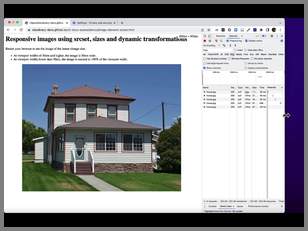
Responsive images using srcset, sizes and dynamic transformations
You can use the <img> tag with srcset and sizes to deliver images that are correctly sized for the viewport.
<img
  sizes="(min-width: 50em) 50em, 100vw"
  srcset="https://res.cloudinary.com/demo/image/upload/f_auto/q_auto/c_scale,w_256/docs/house.jpg 256w,
          https://res.cloudinary.com/demo/image/upload/f_auto/q_auto/c_scale,w_512/docs/house.jpg 512w,
          https://res.cloudinary.com/demo/image/upload/f_auto/q_auto/c_scale,w_768/docs/house.jpg 768w,
          https://res.cloudinary.com/demo/image/upload/f_auto/q_auto/c_scale,w_1024/docs/house.jpg 1024w,
          https://res.cloudinary.com/demo/image/upload/f_auto/q_auto/c_scale,w_1280/docs/house.jpg 1280w"
  src="https://res.cloudinary.com/demo/image/upload/f_auto/q_auto/c_scale,w_512/docs/house.jpg"
  alt="Responsive house" />
See how the browser loads the larger sized images as the viewport increases:
This is a modal window.
The srcset attribute
The srcset attribute specifies the different sized images, together with a width descriptor for each. The width descriptor tells the browser what the image's width is, so for example, 256w means 256 pixels. The browser decides which image to load based on the width of the viewport.
srcset="https://res.cloudinary.com/demo/image/upload/f_auto/q_auto/c_scale,w_256/docs/house.jpg 256w,
...
Using Cloudinary transformation parameters in the URLs lets you resize the same image on the fly, so you only need one original asset. For example, c_scale,w_256 delivers an image scaled to 256 pixels.
The sizes attribute
The sizes attribute tells the browser which size of image to use for different page layouts.
For example, the following means if the viewport is at least 50em (50 times the current font size) wide, the image will be 50em wide. Otherwise, the image will be 100vw (100% of the viewport) wide:
sizes="(min-width: 50em) 50em, 100vw"Responsive images using image elements interactive demo
Try this responsive demo to see how the browser loads different sized images based on the viewport width.
View the demo code in GitHub.
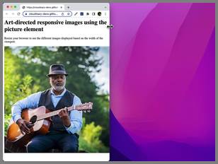
Art-directed responsive images using the picture element
The <picture> element is a wrapper for the <img> element. It also provides a way to supply alternative <source> elements, which are visually distinct versions of the image for the browser to display at the specified breakpoints.
<picture>

<source
  media="(min-width: 800px)"
  srcset="https://res.cloudinary.com/demo/image/upload/ar_2:1,c_fill,g_face/f_auto/q_auto/c_scale,w_800/docs/guitar-man.jpg 800w,
  https://res.cloudinary.com/demo/image/upload/ar_2:1,c_fill,g_face/f_auto/q_auto/c_scale,w_1600/docs/guitar-man.jpg 1600w"
  sizes="100vw" />

<source
  media="(min-width: 600px)"
  srcset="https://res.cloudinary.com/demo/image/upload/f_auto/q_auto/c_scale,w_600/docs/guitar-man.jpg 600w,
  https://res.cloudinary.com/demo/image/upload/f_auto/q_auto/c_scale,w_1200/docs/guitar-man.jpg 1200w"
  sizes="100vw" />

<img
  srcset="https://res.cloudinary.com/demo/image/upload/ar_1:1,c_thumb,g_face/f_auto/q_auto/c_scale,w_400/docs/guitar-man.jpg 400w,
  https://res.cloudinary.com/demo/image/upload/ar_1:1,c_thumb,g_face/f_auto/q_auto/c_scale,w_800/docs/guitar-man.jpg 800w"
  src="https://res.cloudinary.com/demo/image/upload/f_auto/q_auto/c_scale,w_400/docs/guitar-man.jpg"
  alt="Man playing guitar"
  sizes="100vw" />

</picture>
See how the image changes based on the viewport width:
This is a modal window.
The source element
Each <source> element has a srcset attribute, as described in the previous section, and a media attribute that specifies the minimum width from which to display one of the images given in the srcset attribute.
For example, if the viewport is at least 800 pixels wide, the browser chooses an image from the srcset in this source:
<source
  media="(min-width: 800px)"
  srcset="https://res.cloudinary.com/demo/image/upload/ar_2:1,c_fill,g_face/f_auto/q_auto/c_scale,w_800/docs/guitar-man.jpg 800w, https://res.cloudinary.com/demo/image/upload/ar_2:1,c_fill,g_face/f_auto/q_auto/c_scale,w_1600/docs/guitar-man.jpg 1600w"
  sizes="100vw" />
In this case, the image is cropped to an aspect ratio of 2:1 (ar_2:1), using the fill cropping mode (c_fill), with the face as the focal point of the crop (g_crop). It's then scaled down to give two different sizes from which the browser can choose the most appropriate size.
If the viewport is between 600 pixels and 800 pixels wide, a different image is used. This time, it's the full image, just scaled down:
<source
  media="(min-width: 600px)"
  srcset="https://res.cloudinary.com/demo/image/upload/f_auto/q_auto/c_scale,w_600/docs/guitar-man.jpg 600w, https://res.cloudinary.com/demo/image/upload/f_auto/q_auto/c_scale,w_1200/docs/guitar-man.jpg 1200w"
  sizes="100vw" />
Otherwise, if the viewport is less than 600 pixels, the srcset in the <img> tag is used:
<img
  srcset="https://res.cloudinary.com/demo/image/upload/ar_1:1,c_thumb,g_face/f_auto/q_auto/c_scale,w_400/docs/guitar-man.jpg 400w,https://res.cloudinary.com/demo/image/upload/ar_1:1,c_thumb,g_face/f_auto/q_auto/c_scale,w_800/docs/guitar-man.jpg 800w"
  src="https://res.cloudinary.com/demo/image/upload/f_auto/q_auto/c_scale,w_400/docs/guitar-man.jpg"
  alt="Man playing guitar"
  sizes="100vw" />
In this case, it's a 1:1 thumbnail crop focusing on the face (ar_1:1,c_thumb,g_face).
Art-directed responsive images interactive demo
Try this responsive demo to see how the browser loads differently cropped images depending on the viewport size.
View the demo code in GitHub.
Responsive breakpoint generator
Having too many image versions reduces the number of CDN cache hits for requested images and increases the average delivery time for images to your users. On the other hand, having too few image versions means delivering images to users that are larger than needed for the available width, and end up being scaled down by the browser. Cloudinary's Responsive Breakpoints Generator is an open source tool that can be used to calculate the optimal number of versions needed for every image that balances the number of image versions generated vs. the file size reduction between each version. The set of breakpoints are thus calculated based on a difference in the actual image file size at different widths.
The Responsive Breakpoints Generator enables you to interactively generate responsive image breakpoints. However, for applications that involve user-generated content of images dynamically uploaded to your site, you may want to streamline the breakpoints generation process. You can use Cloudinary's API to upload your images to the cloud and automatically generate breakpoints programmatically:
cloudinary.v2.uploader
.upload("sample.jpg", { responsive_breakpoints: {
  create_derived: true, bytes_step: 20000, min_width: 200, max_width: 1000,
  transformation: { crop: 'fill', aspect_ratio: '16:9', gravity: 'auto' } } })
.then(result=>console.log(result));
The upload response includes the URLs you'd need for the image sources:
"responsive_breakpoints": [
  {
    "breakpoints": [
      {
        "width": 1000,
        "height": 562,
        "bytes": 49056,
        "url": "http://res.cloudinary.com/carl/image/upload/ar_16:9,c_fill,g_auto/c_scale,w_1000/v1682083374/nhjwymte6nzu5blqipfk.jpg",
        "secure_url": "https://res.cloudinary.com/carl/image/upload/ar_16:9,c_fill,g_auto/c_scale,w_1000/v1682083374/nhjwymte6nzu5blqipfk.jpg"
      },
      {
        "width": 951,
        "height": 534,
        "bytes": 42770,
        "url": "http://res.cloudinary.com/carl/image/upload/ar_16:9,c_fill,g_auto/c_scale,w_951/v1682083374/nhjwymte6nzu5blqipfk.jpg",
        "secure_url": "https://res.cloudinary.com/carl/image/upload/ar_16:9,c_fill,g_auto/c_scale,w_951/v1682083374/nhjwymte6nzu5blqipfk.jpg"
      },
      {
        "width": 639,
        "height": 359,
        "bytes": 23413,
        "url": "http://res.cloudinary.com/carl/image/upload/ar_16:9,c_fill,g_auto/c_scale,w_639/v1682083374/nhjwymte6nzu5blqipfk.jpg",
        "secure_url": "https://res.cloudinary.com/carl/image/upload/ar_16:9,c_fill,g_auto/c_scale,w_639/v1682083374/nhjwymte6nzu5blqipfk.jpg"
      },
      {
        "width": 200,
        "height": 112,
        "bytes": 4108,
        "url": "http://res.cloudinary.com/carl/image/upload/ar_16:9,c_fill,g_auto/c_scale,w_200/v1682083374/nhjwymte6nzu5blqipfk.jpg",
        "secure_url": "https://res.cloudinary.com/carl/image/upload/ar_16:9,c_fill,g_auto/c_scale,w_200/v1682083374/nhjwymte6nzu5blqipfk.jpg"
      }
    ],
    "transformation": "ar_16:9,c_fill,g_auto"
  }
],- Consider including the
responsive_breakpointsparameter in an upload preset, which you can reuse for many images, without having to specify it in every upload request. - If using an upload preset together with auto-upload you can also set the
notification_urlparameter in the upload preset to handle the returnedbreakpointswithin your image workflow.
For more information on requesting breakpoints and possible parameter values, see the responsive breakpoint request settings documentation.