In part one (One pixel is worth three thousand words) of this turned-to-be-two-part blog post, I discussed one-pixel images and how well different image formats “compress” these images. I was surprised how much there is to be said about the matter. This was supposed to be a short blog post, describing one-pixel images and how they compress, and instead it became a glorious monster (and also a two part blog post…).
Seems that my fellow image compression enthusiasts were as excited as I am about this subject! This blog post sparked a fascinating Reddit discussion, in which other formats like BMP and TIFF are considered, and a 141-byte one-pixel JPEG file was given (smaller than the 160-byte JPEG file that I thought was minimal).
With that in mind, I’m happy to introduce part two, where we’ll look at single-color images and examine them in length. I hope you find it interesting and would love to hear your thoughts and insights!
The most predictable image
As we saw in part one, single-pixel images are the worst-case scenario for image compression: they’re all headers and overhead, and very little data. You can’t really compress anything, since compression depends on predictability, and how are you supposed to predict one single pixel?
In this second part of the blog post, we go to the other extreme: extremely predictable images.
The most predictable image is a large rectangle in a single color. In other words, a scaled-up version of the one-pixel images I discussed in part one. An empty canvas, if you want. A blank sheet.
Compression algorithms should be really good at compressing an image where every pixel is the same color. It’s the best-case scenario, the ultimate in predictability – once you’ve seen the first pixel, you’ve seen them all.
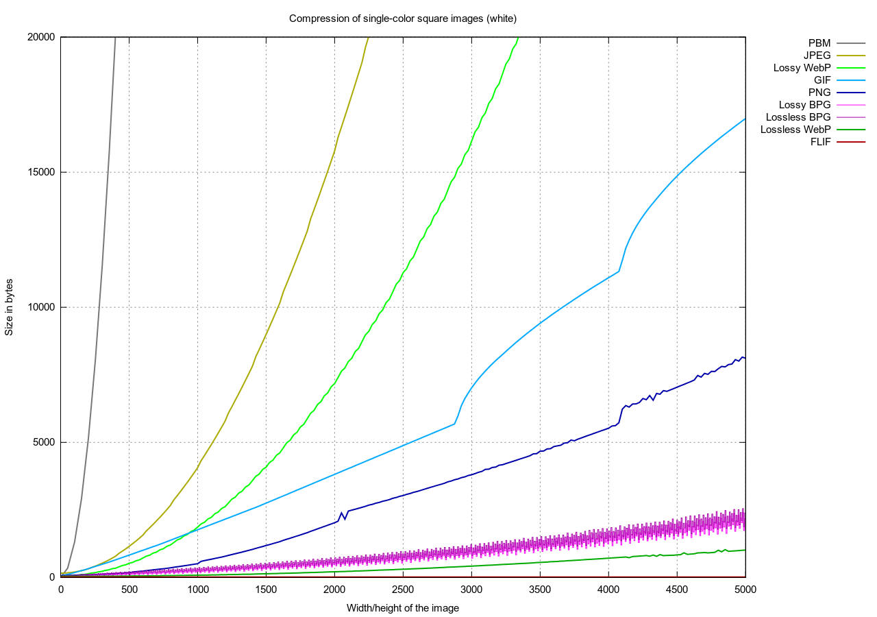
Let’s take a single white pixel and scale it up to increasingly larger squares, and see how the various image formats perform. I wrote a little script to do just that. Here’s the result:
Since we’re looking at squares, the number of pixels is, well, the square of the number on the x-axis: as the width of the square goes from 1 to 5000 pixels, the size of the image goes from 1 pixel to 25 megapixels. So it’s not surprising that some of the curves look like quadratic functions. The uncompressed PBM format obviously has a file size that is (asymptotically) linear in the number of pixels (1 bit per pixel in this case). But JPEG and lossy WebP are also linear in the number of pixels (quadratic in the width of the square) – just with a better constant factor. In other words, they seem to have some inevitable cost per pixel. For JPEG, it looks like you need at least 2 bits per 8x8 macroblock.
This means that JPEG and lossy WebP have a theoretical limit on the compression ratio you can achieve with them: you can’t do better than 0.031 bits per pixel (for JPEG) or 0.014 bits per pixel (for lossy WebP).
Most of the other formats do not seem to have such a limitation. They do not look like a quadratic curve in the above plot. Let’s see what we have here.
- GIF has a rather peculiar curve: it keeps going in a straight line for quite a while, but then it’s like it ‘shifts gears’ twice: first at some point just before 3000x3000, and then again just after 4000x4000. I don’t know the explanation for this behavior.
- The PNG curve goes in a more or less straight line, with some ‘coughs’ and ‘jumps’ around powers of two (1024, 2048, 4096) which might be due to the changing behavior of the underlying zlib compression at such boundary points.
- Lossy BPG and lossless BPG are quite close to one another – you can tell that these are just two different settings of the same compression algorithm, in contrast to WebP where the lossy and the lossless variant are completely unrelated algorithms. The weird thing with BPG is that the file size fluctuates up and down quite strongly as the image gets larger. It’s easier to see this if you zoom in on part of the plot:
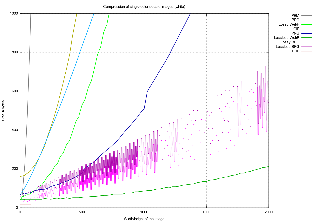
For example, a 568x568 white square takes 232 bytes as a lossless BPG, while a slightly larger 569x569 white square takes only 144 bytes. Weird. * Lossless WebP has a nice low curve: a 25 megapixel white square (5000x5000) still only takes 1012 bytes. * FLIF is the king of this competition: it doesn’t matter what the image dimensions are, if all pixels are white, the FLIF file will be 19 bytes. This is a side-effect of a more general, quite simple compression technique FLIF uses. For each color channel (in this case there is only one: luma), the header can optionally contain a lower bound and an upper bound on the values that actually occur in the image. By reducing the range of values, better compression can be achieved. In this case, the range is reduced to one single value (white, or 255 if you express it as an 8-bit number). Once you know that this is the range, every pixel becomes as cheap as it can be: exactly zero bits.
In the plots above, it’s still a bit hard to see the asymptotic behavior of the various formats. Let’s plot the data in a different way: let’s look at the relative file size, i.e. the bits needed per pixel. Instead of looking at the number of bits per pixel, which would be very small, let’s look at the number of pixels per bit. The bang for the buck, so to speak. Here is a plot of the compressed white squares, with pixels per bit on the (logarithmic) Y-axis:
As expected, uncompressed PBM very quickly converges to 1 pixel per bit, as the overhead of the header and padding becomes less and less important. JPEG and lossy WebP also quite quickly converge to what appear to be their theoretical limits – 32 pixels per bit, and just above 70 pixels per bit, respectively.
GIF is more interesting: it keeps getting more and more pixels per bit, until it almost gets to 200 pixels per bit. It then seems to repeatedly bump its head against that ceiling.
PNG quite rapidly goes over that 200 ppb ceiling and keeps getting better, though above about 1000x1000, the improvement gets much slower and bumpier.
BPG and lossless WebP behave in a similar way: first they get better and better very rapidly, but then improvement gets slower and the pixels per bit curve becomes nearly horizontal. They can both achieve more than 1000 pixels per bit.
FLIF ‘cheated’ by not having to encode anything at all, so obviously it rapidly grows and keeps growing.
How far can we take this? Well, the largest image dimension that is supported by all of the above formats, is 16383x16383 pixels (268 megapixels). Let’s see what we get for this huge white square:
|
Format |
Bytes |
Pixels per bit |
|
PBM |
33,552,399 |
1.00 |
|
PNG |
53,132 |
631.45 |
|
GIF |
182,225 |
184.11 |
|
JPEG |
1,048,737 |
31.99 |
|
Lossy WebP |
477,334 |
70.29 |
|
Lossless WebP |
10,368 |
3,235.95 |
|
Lossy BPG |
16,734 |
2,004.90 |
|
Lossless BPG |
18,032 |
1,860.60 |
|
FLIF |
19 |
1,765,807 |
Would there be any difference if the huge square was black instead of white? Let’s look at the pixels-per-bit plot.
And here are the numbers for a huge 268-megapixel black square:
|
Format |
Bytes |
Pixels per bit |
|
PBM |
33,552,399 |
1.00 |
|
PNG |
32,645 |
1,027.73 |
|
GIF |
182,225 |
184.11 |
|
JPEG |
1,048,737 |
31.99 |
|
Lossy WebP |
477,334 |
70.29 |
|
Lossless WebP |
10,366 |
3,236.57 |
|
Lossy BPG |
16,734 |
2,004.90 |
|
Lossless BPG |
18,032 |
1,860.60 |
|
FLIF |
15 |
2,236,689 |
It turns out that for some formats, there actually is a difference between black and white squares, and black is always more compact than white. In PNG, it makes quite a big difference: a huge white square is 53 KB, while a huge black square is only 32 KB. Also, the pixels-per-bit curve looks much smoother for black squares than for white squares.
You might wonder what causes this difference between white and black in PNG. The explanation is that the image data in a PNG is basically PNM+zlib, with one important difference: a “filter” can be applied to make the data compress better. PNG supports five filter types (None, Sub, Up, Average and Paeth), and each image row can have a different filter. Every row gets prefixed with one extra byte which indicates the filter type for that row.
Now what is the best way to encode a fully white image in PNG? Well, it does not really matter much which filter type you use – whichever you pick, the actual filtered data bytes will either be mostly 0 or mostly 255. The thing is, if you pick filter type None (encoded as 0), then the filtered data is all 255, while if you pick any other filter type (encoded as 1 to 4), then the filtered data becomes mostly all zeroes. In any case, you don’t get a big sequence of identical bytes – there is an interruption at the beginning of each row. You get a repetitive pattern, with a length that depends on the width of the image. This explains the jumps around widths that are a power of two: those are the points where zlib needs more bits to represent the LZ77 distances.
A fully black image is easier: you can just pick filter type 0. The filtered data is all zeroes whatever you do, so the data to be compressed is one big sequence of only zeroes. And that is pretty much the best-case scenario for zlib, so you get pretty close to zlib’s theoretical limit, which is a 1032:1 compression ratio.
A fully transparent image gets more or less the same compression as a fully black image, for the same reason: it’s one big sequence of zeroes (just a longer sequence because there’s the extra alpha channel).
If you examine the 32 KB huge black square PNG file, you’ll notice that even though it is already compressed over a thousand times, the resulting compressed data is still very repetitive. In other words, the compressed data can be compressed even further. Indeed: running gzip on this 32 KB PNG file produces a .gz file of just 225 bytes.
Wow. This was a pretty long and technical blogpost, and yet we’ve only covered the simplest possible kind of images: first one single pixel, and then the same single pixel scaled-up to larger and larger squares. While these are certainly not the most useful, nor the most representative types of images, they can still tell us something about the limits of the image formats which we have considered: PNG, GIF, JPEG, uncompressed PNM/PAM, lossy and lossless WebP and BPG, and FLIF. We’ve seen the worst-case and the best-case behavior of these image formats: from 160 bytes for a single pixel, all the way down to 15 bytes for 268 megapixels.
If you made it this far, congratulations! I hope you learned something new while reading all of this. I sure did while writing it!

