As the end of 2015 approaches, we wanted to share a quick summary of Cloudinary’s accomplishment this year and some of our plans for next year. We couldn't possibly do this without including an image transformation example! That's our hat trick in the title :-)

Five years ago, Ethan Marcotte coined the term “responsive web design” and gave it three defining ingredients: fluid grids, flexible media, and media queries.
That second ingredient, “flexible media” turned out to be a bit of a bugbear.

What better way to sum up the year than with our latest 10 Startups compilation (part 7!)? As Cloudinary continues to grow, so does our customer base, with customers ranging in size and variation. In fact, out of our 2,500 paying customers, many are startups in various stages. We are always pleased to share the different use cases and verticals of these customers, and hope you find them interesting.
It can be quite a challenge to graphically design a website or mobile application that displays images in very precise shapes and orientations. Product customization can take the form of warping 2D pictures to have a 3D perspective, placing images in precise shapes or overlaying images in specific locations within another image, for example: overlaying an image over the screen of a smartphone.

Content Optimization and Personalization programs can deliver tremendous ROI to an organization but tend to be very resource intensive, requiring developers to build the code for alternate experiences and creative folks to generate the content. Many of the content optimization/personalization tools out there today (Maxymiser, Optimizely, Adobe Target, Ensighten etc.) have created WYSIWYG (What You See Is What You Get) editors to help relieve the code/development bottleneck but the creative bottleneck stubbornly remains.

Last week I was part of a three member Cloudinary team that attended and exhibited at Web Summit 2015 in Dublin. Just in the last four years, the event has grown from a few hundred people to more than 42,000 people from 134 countries who attended this year.

At the end of 2014, activity on smartphones and tablets accounted for 60% of the time Americans spent online, according to comScore. Given the fast migration to mobile, these figures have been growing every year, and this trend in migration is not limited to the US market alone. According to a recent IDC report, the leading mobile vendors shipped a total of 334.4 million smartphones worldwide in the first quarter of 2015 (1Q15), up 16% from 288.3 million units in 1Q14. With this rise in mobile adoption, it seems like more users are turning to their mobile devices to perform online activities rather than their desktop computers.
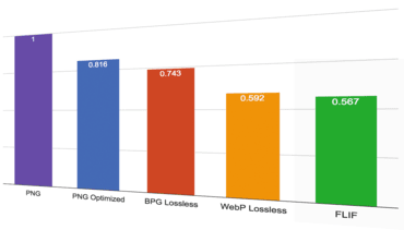
A fresh new lossless image format has recently been introduced. It is called FLIF, which is an acronym for Free Lossless Image Format. According to the creators of FLIF, it is supposed to significantly outperform the other image formats that have lossless modes, such as PNG, WebP and the new BPG format.

If you have an application that allows users to upload their own photos, it can be very useful to be able to organize these photos according to their content. This will allow you to categorize the content for displaying to all your users and make your image library searchable. Furthermore, you can also learn more about your users according to the content they upload and find different trends of what people care about. Other added benefits can also include the ability to display matching content to your users according to their interests or even match them with other users that share similar interests.

Back in 2013, Cloudinary published a blog post entitled "Top 10 Mistakes in Handling Website Images". Though these top 10 mistakes still hold true, we've come up with a few additional points that we thought you'd find of interest.