We all know the good ol', tireless <img> element, which has been a long-time go-to for inserting graphics into webpages. Time doesn’t stop, however, and neither do technological advancements. So, let’s get you up to speed with the element’s modern alternative: the <picture> element.
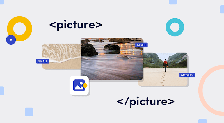
Unlike <img>, <picture> has a declarative approach for loading images, i.e., instead of only one image, <picture> takes any number of alternative images. The version that loads for the viewer depends on such factors as screen resolution and device. With <picture>, you no longer have to scale image resources.
In effect, <picture> takes <img> to the next level. Not only does <picture> make your website look more professional by showing screen-optimized images, it also fosters search engine optimization (SEO) and compatibility.
This article explains how <picture> compares to <img> and how to best harness the full power of <picture>.
The <picture> Element Versus the <img> Element
<picture> triumphs over <img> in three significant areas.
Resolution switching. Crisp, high-resolution images go a long way in making your site—and therefore your brand—look professional. You can switch to a version of your image that best suits the viewer’s screen resolution with
<picture>.Image rendering. With
<picture>, you can render images based on the file format. That’s a remarkable capability because not all browsers support all file formats.For instance, although most browsers—most recently, Safari—support WebP, less common browsers, such as KaiOS, do not. By serving images in specific formats with
<picture>, you can ensure that all your site visitors enjoy a similar experience regardless of their browser.Artistic control. You have complete artistic control with
<picture>—a tremendous advantage for implementing art direction in responsive design. Instead of scaling an image up or down to fit the screen, you can leverage various versions of the image for specific viewports by editing themediaattribute of the<source>subelement.Say, you want to showcase a high-quality photo of wild horses on your site. The full version looks great on desktop, but the details are lost on smartphones. With
<picture>, you can serve an alternative photo to smartphone users—perhaps by zooming in on one of the horses.You could also display a wide banner-ad on desktops and a square ad on smartphones.
Components of the <picture> Element
Obviously, <picture> offers more options than <img> and, correspondingly, a more captivating user experience.
<picture> mainly accepts two subelements: source and img. The code sample below shows a <picture> element with various image options.
<picture>
    <source media="(min-width: 950px)" srcset="Large_image_of_cat.jpg">
    <source media="(min-width: 650px)" srcset="medium_image_of_cat.jpg">
    <source media="(min-width: 465px)" srcset="small_image_of_cat.jpg">
    <img src="image_of_cat.jpg" alt="an image of a cat">
</picture>
The <source> Subelement
<source>, the first part of <picture>, specifies the media resources for pictures, audio, and video. Like many other HTML elements, including <br/>, <source> is empty and self-closing: it has no content and hence needs no closing tag.
In case of multiple <source> subelements, the browser chooses the first matching one based on specific criteria like viewport. Absent a matching <source>, the browser falls back to <img>. More details on that behavior later in this article.
Attributes
media: Themediaattribute designates resources for specific screen sizes, such as those for desktops, tablets, laptops, or mobile devices.mediaaccepts valid queries on a typical stylesheet.
media used to work in video before on the Chromium browser and still works on Safari. Web-performance expert Scott Jehl has proposed the reintroduction of that attribute for video vis-a-vis the <picture> element, which would be a huge boon for developers. See his full proposal HTML Video Sources Should Be Responsive.srcset: As an alternative to the<src>attribute,<srcset>specifies audio or video elements for various situations.sizes: This attribute, which depends on<srcset>, specifies an image resource’s rendered width.<sizes>takes effect only if you also specify thewidthdimension-descriptor with<srcset>. Also,sizesonly works for<source>directly within the<picture>element.type: This attribute specifies the image resource’s Multipurpose Internet Mail Extensions (MIME) type. Examples of those MIME types are<image/png>,<image/jpeg>,<image/svg>, and<image/webp>.
Usage
Just like other HTML elements that accept attributes, <source> holds all its attributes, as in the code sample below:
<!-- source element to be placed within a picture element -->
<source srcset="some-random-image.png" type="image/png" media="(max-width: 900px)">
The <img> Subelement
<img>, the second subelement of <picture>, primarily serves as a fallback in case of no available resources in <source> for rendering.
Attributes
src: A mandatory attribute for<img>,srccontains the path to the image resource held by<img>.alt: This attribute contains the text that describes the image resource. If that resource is missing, the browser displays the<alt>text, which also gives clues to visually impaired individuals on what the image is about. And, as a bonus,<alt>text might also improve SEO.cross-origin: This attribute takesuse-credentialoranonymousas its value so that third-party sites with cross-origin access enabled work in a<canvas>element.height: This attribute specifies the image resource’s height.loading: This attribute takeslazyoreageras its value, based on which the browser would either load the image immediately or wait until a set of conditions are met.width: This attribute specifies the image resource’s width.
<img> also accepts general HTML attributes: styles, class, id, title.Usage
Just like the <source> subelement, <img> is a void or self-closing subelement that does not accept content. You specify each attribute and its value, as in the code sample below:
<!-- img element to be placed within the picture element -->
<img src="angry-man.gif" alt="An angry man" width="72" height="72" style="color:red">
Best Practices
If an image resource displays well on both mobile and desktop screens, <picture> would be overkill so use <img> instead.
Also, certain browsers, such as Opera Mini, do not support <picture>. As a safeguard, always specify a fallback image-resource with <img>.
<picture> in Action
As mentioned, <picture> takes <img> and <source> as its essential components. <source> is optional, and you can have multiple <source> subelements, each containing an image resource to render under a specified condition. The browser selects the first <source> subelement that matches those conditions.
The srcset attribute can also take multiple image resources. The browser selects which item to render based on the width you specified.
<source srcset="small_image_of_cat.jpg 420w, Medium_image_of_cat.jpg 700w, Large_image_of_cat.jpg 1200w" alt="Image of a cat">
In the above snippet, we load three different images from one <source> element. For each resource, we set a corresponding width to define when the browser should render that image. A good tip is to take the mobile-first approach, specifying the width for the smallest image first, followed by the width of each of the larger images in ascending order.
On the other hand, <img> is mandatory, serving as a default subelement. You can specify only one <img> subelement within a <picture> element.
The code sample below shows <picture> in action.
<picture>
    <source media="(min-width: 650px)" srcset="Large_image_of_cat.jpg">
    <source media="(min-width: 650px)" srcset="medium_image_of_cat.jpg">
    <source media="(min-width: 465px)" srcset="small_image_of_cat.jpg">
    <img src="image_of_cat.jpg" alt="an image of a cat">
</picture>
Here, <source> specifies a different image for mobile, tablet, and desktop. See these CodeSandbox examples for how the images look in those devices. For a feel of the effect of <picture>, resize the images to various screen sizes.
Summary
The <picture> element effectively facilitates image switches that depend on the viewport size, shape, and resolution. It’s also handy for serving different images so that your audience sees what you want them to see no matter their browser of choice.
Another significant benefit is that <picture> holds zero or more <source> subelements, each containing an image resource, and an <img> subelement that holds the fallback image absent a matching <source> subelement. On top of that, <picture> serves the best image for the viewer’s device, ensuring high-quality content regardless of screen size.
Transforming images with Cloudinary works perfectly with <picture> and its subelements. Not only does Cloudinary automatically configure an optimal <srcset> attribute that accords the browser image options, the platform also supports art direction out of the box, leading to fast-loading and well-displayed websites on all screens and browsers.
About the Author
 |
Amarachi Amaechi is a front-end developer with a focus on turning UI designs into code and on building scalable, accessible, and user-friendly applications. In addition, she is passionate about creating developer tools and communities, writing, and public speaking. |


