“For those of you who are watching in black and white, the pink is next to the green.” (Ted Lowe)
We often laugh about snooker (think billiards if you’ve never heard of snooker) commentaries back in the days of black and white television, but for approximately 300 million people worldwide, the seemingly simple task of distinguishing colors is a daily challenge. Color blindness, or Color Vision Deficiency (CVD), affects roughly one in twelve men, and one in two hundred women. That's over 8% of the population - a significant percentage of your potential customers who may be missing vital information or unable to engage fully with your site. Couple that with increasing legislation promoting accessibility and it's easy to see why you should care about color.
Cloudinary has a number of features that can help you to choose the best images as well as to transform problematic images to ones that are more accessible to color blind people. You can use Cloudinary to:
- Simulate how an image would look to people with different color blind conditions.
- Apply effects to images to help differentiate problematic colors.
- Analyze images to provide color blind accessibility scores and information on which colors are the hardest to differentiate.
Look Through a Different Lens
To help you see your images through the eyes of a color blind person, you can transform the images to simulate seven different conditions: deuteranopia, protanopia, tritanopia, tritanomaly, deuteranomaly, cone monochromacy and rod monochromacy. If you’re familiar with Cloudinary transformations, you’ll know that you can apply these effects just by adding a parameter to the URL of the image. In this case it’s the simulate_colorblind effect: e_simulate_colorblind:<condition>. If you don’t specify a condition, then deuteranopia is the condition that is simulated. This is the most common form of color blindness and is a reduced sensitivity to green light, so reds and greens are hard to tell apart.
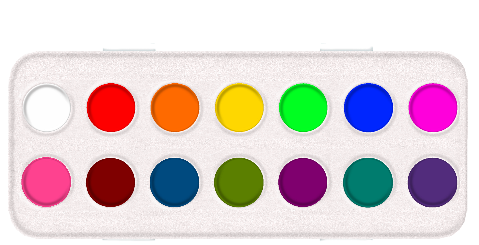
Take, for example, this image of a paint palette. If you’re not color blind you’ll see fourteen different colors. Compare that with the transformed images below. They are the same image as seen by someone with deuteranopia, and someone with cone monochromacy.
Here’s the full range of simulated conditions:
See What You’re Missing
Being color blind doesn’t just mean seeing colors differently. You can actually miss vital information depending on the composition of the image. Some objects can be totally camouflaged. Take this image of a flower, as seen by someone with deuteranopia:
It’s not easy to spot the green grasshopper lurking there due to the redness of the petals. Did you see it?
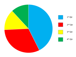
Even if colors and shapes are well separated, images that convey meaning by color can be problematic. Note how difficult it is for someone with deuteranopia to match the key to segments of this pie chart:
You can help your color blind customers by using the assist_colorblind effect (e_assist_colorblind). There are two ways to help:
- Add vertical and horizontal stripes to problematic colors, specifying the intensity of the stripes with a number between 1 and 100, for example,
e_assist_colorblind:20:
- Change the colors to ones that are less problematic, using the
xrayoption,e_assist_colorblind:xray:
In each of the above examples, the image on the left is how a normal sighted person would see the image with the assist_colorblind effect. On the right, we’ve chained the simulate_colorblind effect to show how the transformed image would look to a color blind person. The segments of the pie chart are now distinguishable due to the striping, and the grasshopper is now visible due to the change of colors.
How Accessible are your Images?
With disability awareness being at an all time high, and more and more legislation coming in regarding accessibility, you need to make sure that the shopping experience that you provide caters to everyone.
Having the means to analyze your images objectively and search for the ones with the best scores would allow you to select the most appropriate images, confident that they conform to the expected standards.
Introducing Cloudinary’s color blind accessibility analysis scores.
Now’s your chance to take part in the color blind accessibility analysis Beta trial. With this feature activated on your account, the response to an upload or explicit request with accessibility_analysis set to true includes scores for different visual accessibility factors, as follows:
"accessibility_analysis": {
    "colorblind_accessibility_analysis": {
      "distinct_edges": 0.93,
      "distinct_colors": 0.33,
      "most_indistinct_pair": [
        "#BCB0AA",
        "#B2BEC9"
      ]
    },
    "colorblind_accessibility_score": 0.63
  },
Check out the documentation for further details about each of the scores. On upload, the accessibility_analysis.colorblind_accessibility_score field is indexed for search so you can easily find images that meet your organization’s requirements.
If you want to be able to track the accessibility scores of all images being uploaded to your account, the easiest way to do this is through an upload preset. Just activate the Accessibility analysis option when creating your upload preset.
Here are the scores for the images used in this blog post:
| Paint palette | Flower | Pie chart |
|---|---|---|
 |
 |
 |
| "distinct_edges": 1.0 | "distinct_edges": 0 | "distinct_edges": 1.0 |
| "distinct_colors": 0.08 | "distinct_colors": 0.12 | "distinct_colors": 0.77 |
"most_indistinct_pair": [ "#FA3300", "#FA3300",  "#00FD20" "#00FD20" ] |
"most_indistinct_pair": [ "#F54802", "#F54802", "#4D6602" "#4D6602"] |
"most_indistinct_pair": [ "#FE0000", "#FE0000",  "#00AF50" "#00AF50" ] |
| "colorblind_accessibility_score": 0.54 | "colorblind_accessibility_score": 0.06 | "colorblind_accessibility_score": 0.89 |
At present, only the accessibility_analysis.colorblind_accessibility_score is indexed for search, but it may be more meaningful to identify images that score low for either distinct_edges or distinct_colors. One way to do this is to evaluate the score on upload using the eval parameter and tag those images that don't meet a certain threshold. The JavaScript assigned to the eval parameter might look like this:
if (resource_info.accessibility_analysis.colorblind_accessibility_analysis.distinct_edges < 0.8)
{
   upload_options["tags"] = "distinct_edges_issue";
}
if (resource_info.accessibility_analysis.colorblind_accessibility_analysis.distinct_colors < 0.8)
{
   if (upload_options["tags"])
   {
      upload_options["tags"] += ",distinct_colors_issue";
   }
   else
   {
      upload_options["tags"] = "distinct_colors_issue";
   }
}
Using the CLI as an example, the full upload command would be as follows (you can, of course, adapt this for different SDKs):
cld uploader upload sample.jpg accessibility_analysis=true -O eval 'if (resource_info.accessibility_analysis.colorblind_accessibility_analysis.distinct_edges < 0.8){upload_options["tags"] = "distinct_edges_issue";} if (resource_info.accessibility_analysis.colorblind_accessibility_analysis.distinct_colors < 0.8) {if (upload_options["tags"]){upload_options["tags"] += ",distinct_colors_issue";}else{upload_options["tags"] = "distinct_colors_issue";}}'You could then use the Admin API to get the resources by tag or the Media Library search to find the images you need to address.
Ideas for Helping your Color Blind Customers
Now you know how to analyze your images to determine which ones may be problematic for your color blind customers, here are a few ideas of what you can do to help.
Firstly, if possible, see if you can replace images that give low accessibility scores with ones that give higher scores. This may be a case of changing the colors used, changing the composition, or selecting an entirely different image.
If you can't change your images, consider putting a toggle on your website or app to display images in a color blind friendly way. Then, you can keep your original images with the original colors for those who can see them, and still provide a way for your color blind customers to see all the details:
- Apply the
colorblind_assist:xrayeffect to images with lowdistinct_edgesscores. - Apply the stripes effect (e.g.
colorblind_assist:20) to images with lowdistinct_colorsscores.
If you allow users to upload their own content to your website, you could make them stop and think about color accessibility by:
- Providing feedback based on the analysis scores on upload.
- Providing a mechanism for them to view their content through the eyes of someone with a color blind condition (e.g.
simulate_colorblind:protanopia).
The Pot of Gold at the End of the Rainbow
Expectations and attitudes regarding accessibility have changed a lot since the days of black and white TV. It’s more important than ever to keep your eye on the ball and make your site as accessible as possible. Helping out your color blind customers is just one consideration, but if you’re trying to broaden your target market and reach out to as many people as possible, you can’t afford to ignore anyone.


