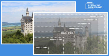
The number of different devices available and their potential screen resolutions keep increasing, and to support this wide range of resolutions and devices, responsive website design is now the standard. A website's markup must adapt itself to look perfect on all the different devices and in various resolutions, pixel densities and mobile device orientations. Managing, transforming and delivering images, is one of the main challenges of breakpoints for responsive design that web developers face.

Five years ago, Ethan Marcotte coined the term “responsive web design” and gave it three defining ingredients: fluid grids, flexible media, and media queries.
That second ingredient, “flexible media” turned out to be a bit of a bugbear.
