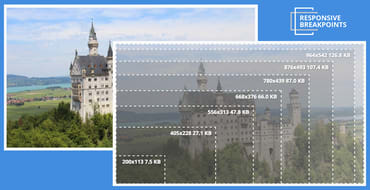
The number of different devices available and their potential screen resolutions keep increasing, and to support this wide range of resolutions and devices, responsive website design is now the standard. A website's markup must adapt itself to look perfect on all the different devices and in various resolutions, pixel densities and mobile device orientations. Managing, transforming and delivering images, is one of the main challenges of breakpoints for responsive design that web developers face.

Five years ago, Ethan Marcotte coined the term “responsive web design” and gave it three defining ingredients: fluid grids, flexible media, and media queries.
That second ingredient, “flexible media” turned out to be a bit of a bugbear.

Responsive web design is a method of designing websites to provide an optimal viewing experience to users, irrespective of the device, window size, orientation, or resolution used to view the website. A site designed responsively adapts its layout to the viewing environment, resizing and moving elements dynamically and based on the properties of the browser or device the site is being displayed on.

Web development was much simpler only a few years ago, when we were building HTML pages that included images and photos, and all elements shared the same resolution units. If for example, you aimed at a standard 1024x768 screen, you knew these were exactly the number of pixels available for displaying HTML elements and images.