(Photo by Erol Ahmed)
A few weeks ago, Google officially announced a new JPEG encoder, called Guetzli.
Cloudinary has been tracking Guetzli since it was soft-launched in October; it has been amazing to watch news about it bubble up into the pop-tech press.
The popular take: Guetzli is an ingenious, Google-backed shot in the arm for the dusty/trusty old JPEG format, which – if you’re willing to wait for its extremely computationally intensive algorithms – produces JPEGs that are 35% smaller (or better) than was previously possible.
Has Google managed to squeeze blood from a stone? I’ve been running some tests to find out; the truth is more complicated, nuanced, and, I think, interesting. Read on!
Butteraugli Brains
Lossy encoders throw data away. Good ones do so artfully, so that we don’t notice. A well-encoded lossy image will look just like the lossless original (to our fickle yet fallible human eyes), despite containing a fraction of its information.
Imaging R&D is most-reliably guided by real-world experiments, in which real people are really asked what they subjectively notice. There are many (many) situations where that kind of testing is impossible, though, and you need an objective, mathematical model that estimates subjective “quality.”
For decades, the image quality metric of choice was PSNR: a tidy piece of information theory which measures the signal of the original against the encoder’s lossy artifacts, or noise.
In 2004, a handful of researchers introduced a new, arguably better, model: SSIM. SSIM was built on a few key insights about some high-level perceptual concepts. Turns out, we pay special attention to patterns and “structures” (and often ignore the really bright bits of an image).
Guetzli’s raison d’être is a brand new metric for image quality, developed by researchers at Google, called Butteraugli. Butteraugli takes modeling the complicated and particular ways that our biological systems actually work to a new level: cells in the retina. Its project description includes the phrases, “low density of blue cones in the fovea” and “more accurate modeling of ganglion cells,” for goodness sake!
Butteraugli is brand new, largely untested, and really interesting. It’s the brains behind Guetzli.
Binary Search Brawn
In most encoders, when you select a “quality” at encode time you’re picking an integer between 1-100 that the encoder’s designers have arbitrarily mapped to a set of arcane technical parameters. As a result, encoding with a “quality” of 86 doesn’t mean that the resulting JPEG will be “86 percent good” in any objective or portable way. Photoshop’s 86 != libjpeg’s 86, and even with the same encoder and input quality, output quality, as measured by metrics like Butteraugli or SSIM, will vary from image to image.
Cloudinary’s q_auto tries to do better. q_auto’s four quality levels (:best, :good (the default), :eco and :low) don’t map to specific sets of arcane encoder settings – instead, via heuristics, a trial encode or two, and some quick checks with a custom SSIM metric, q_auto dials up custom encoding parameters for every image, tailoring them to fit each image’s unique compression characteristics. q_auto lets you select an output quality. A q_auto image will always look good; a q_auto:best image will always look great.
Guetzli takes this idea to its logical extreme. When you select a Guetzli quality, what you’re actually selecting is a specific Butteraugli score; Guetzli then does dozens of full encodes, methodically dialing parameters up and down and measuring the results, until it achieves that precise score.
This stubborn precision, more than anything, is what makes Guetzli so slow. Which brings me to my next point.
Strong Opinions
Guetzli is a very focused, opinionated piece of technology, I found this out the first time I ran it:
$ guetzli --quality 80 original.png guetzli.jpg
Guetzli should be called with quality >= 84, otherwise the
output will have noticeable artifacts. If you want to
proceed anyway, please edit the source code.
Guetzli processing failed
“Please edit the source code”! The sass!
The second run threw me, too: I’d heard it was “slow,” but encoding a one-megapixel image ate up 300 MB of RAM and took a minute and a half. Mozjpeg completes the same task in 300ms.
The Guetzli folks have explained the limited quality range; turns out, Butteraugli is only smart at high quality levels. And they’ve been forthright about the fact that their tool is ripe for optimization. But as it stands, their encoder burns through vast quantities of memory and processing power in order to output JPEGs with precise, and rather high, levels of Butteraugli-calculated “quality.”
What does this actually look like, in practice?
Sfumato? q_auto!
Here’s a comparison between three versions of the Mona Lisa: a lossless original, and JPEGs encoded by both Guetzli and q_auto.
My first impressions: both the Guetzli and the q_auto look quite good. Up close, both seem slightly “fuzzier” than the original. But neither really seems much better or worse than the other – and the q_auto comes in 19% lighter, by bytes.
Breaking out my pixel-peepers, I could start to see some more interesting differences. In Mona’s face, q_auto appears smoother; Guetzli, blockier.
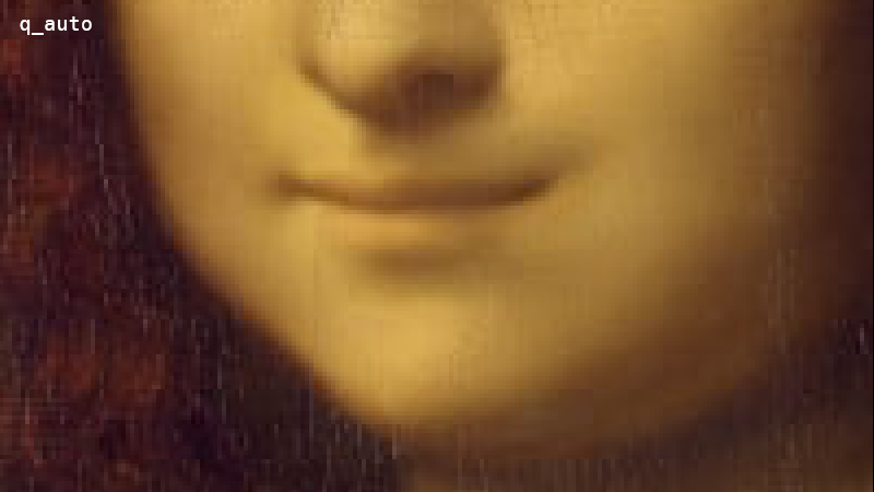
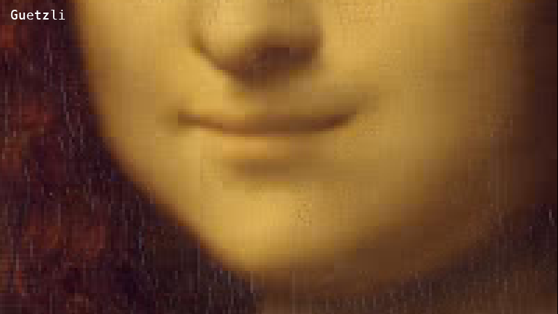
This is evidence of Guetzli working as designed. Guetzli aggressively snaps JPEG DCT coefficients to 0, which results in lots of rather solid 8×8 blocks. It can afford to be aggressive because Butteraugli knows which artifacts we’re likely to notice when the image is viewed at a given resolution and distance1. Block-boundary artifacts that are invisible to my unassisted eyes mean it’s working.
Under the loupe, the Guetzli also looks a bit crisper, preserving more of the hairline cracks in the painting’s glaze.
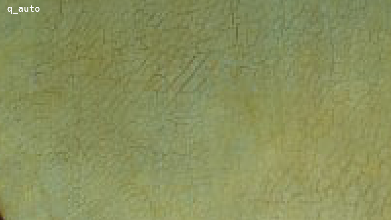
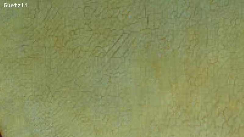
Guetzli appears to be spending everything that it saved in smooth areas like the face (and 20% more) on fine details like this.
So, which is better? DSSIM2 slightly prefers the q_auto over the Guetzli; to my (unassisted) eyes it’s a toss-up. But, again, the Guetzli came in ~20% heavier at it’s lowest-possible quality setting. I was starting to have some doubts about Google’s “35% better for the web” claim.
Nothing Rhymes with Guetzli
My colleague (and the man behind q_auto) Jon Sneyers, provided a different comparison, which highlights Guetzli’s strengths.
This time, the two JPEGs weigh just about the same. And while DSSIM still prefers the q_auto; I think the Guetzli is evidently superior. It looks “cleaner”, with fewer ringing artifacts around the image’s many high-contrast edges.
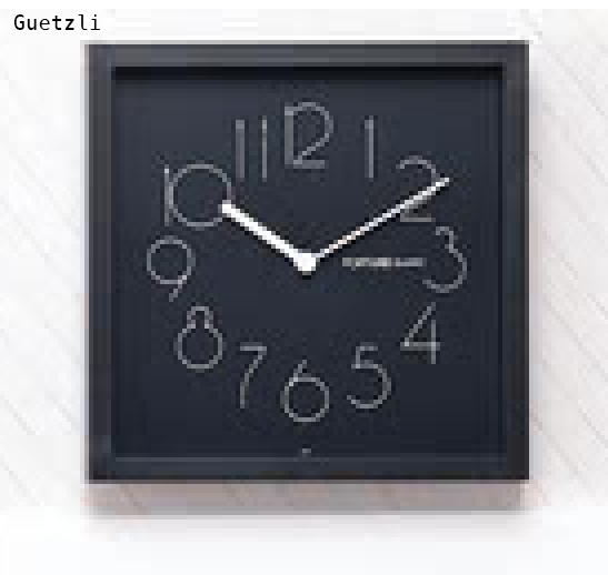
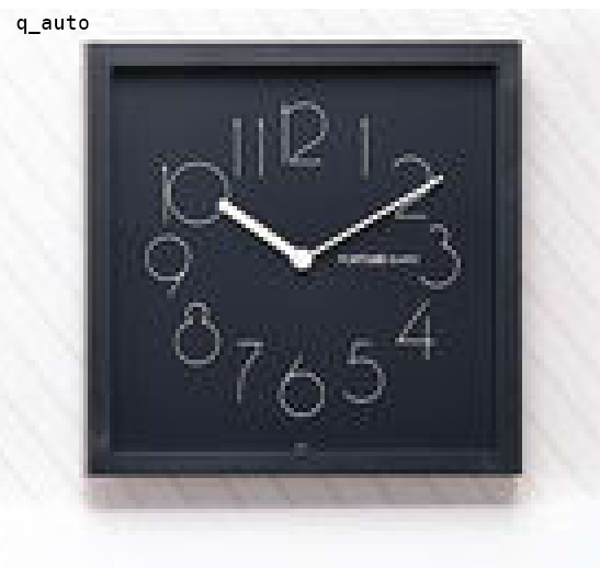
One bad thing: Guetzli completely erases some of the fine, light-gray lines in the background drapes.


Oops! Overzealous zeroing, methinks. Still: point to Guetzli.
A dash of data
Single image comparisons are great, but in order to further evaluate Guetzli, I needed some data. So I asked Jon for a good set of test images, cobbled together some bash, brushed up on my D3, and futzed endlessly with the particulars of this interactive chart:
Each blue dot represents an image. The x-axis represents the amount-of-compression, and the y, “quality”. Lower is better for both; a dot at (0, 0) would represent an (impossible) image that’s identical to the original and takes up no space on disk.
In other words, as you switch between encoders – dots moving down and to the left are good! Up and to the right? Bad. Up/left or down/right: more-or-less neutral.
If you click on the dots, you can see detailed single-image comparisons for yourself.
There’s a lot here; let’s break it down.
First, note that though the Guetzlis, mozjpegs, and libjpegs were all rendered with a --quality of 84, they all make different quality/compression trade-offs. In general, libjpeg produces heavier, higher-quality images; the average Guetzli is smaller, and the mozjpegs are slimmer still. The q_autos are the slimmest of all.
So, a caveat. I sent this article to Kornel Lesiński for review, and he was clear on two points (which he is passionate about):
- If you don’t equalize quality and measure file size, or equalize file size and test quality, comparisons between metrics are often misleading and easily gamed.
- Different levels of quality are different problems; to get a sense of which encoder is “better” in a general sense, you need test it against others at a wide, useful, range of qualities.
I have, of course, done neither of those things. So! Understand that this chart presents a handful of mismatched snapshots – not a complete picture of how these different codecs stack up against one another. I still think there are useful lessons to be learned here (especially with regards to Guetzli’s methods and limits), but if I see anybody linking to this chart and saying “mozjpeg rulz” or “Guetzli droolz” I’ll be very, very sad.
With that in mind, let’s look at the relative qualities. While the Guetzlis are bigger than the mozjpegs and q_autos, to DSSIM, they look worse. But if we switch our quality metric from DSSIM to Butteraugli, the Guetzlis arrange themselves into a perfect, high-quality, horizontal line and blow every other encoder’s results out of the water. Google’s own tests have shown similar results. One key takeaway from all of this for me has been: when Google says “Guetzli is 35% better”, they mean, “it’s 35% better as measured by a metric of our own design, which we built Guetzli specifically to optimize for.”
A couple of other general observations:
- Setting Guetzli aside, DSSIM and Butteraugli mostly agree on the general shapes of the other encoders’ performances. Huh!
q_auto’s qualities are more tightly grouped, with fewer and less-extreme outliers than any other encoder (except for Guetzli as measured by Butteraugli). Jon! (You probably already knew this but) your thing! It works!
Clicking on a bunch of the dots to see these images for myself confirmed my initial impressions.
- The Guetzlis are consistently blockier than the other encoders’ images, but in ways that are usually (but not always) hard for me to notice without a loupe.
- The Guetzlis are often a bit crisper, preserving more fine detail and presenting sharper textures. Though again, without a loupe, this is usually hard to actually see.
- The Guetzlis are much better at keeping ringing artifacts in check, and this is sometimes noticeable to my unassisted eyes.
- But perhaps most importantly: most3 of these images look really good. The apparent quality that Guetzli is producing at its lowest setting is still rather high, and it’s a shame that it doesn’t allow you to trade any more of that quality in, in exchange for more compression. So if you’re archiving originals and want to keep the quality top-notch, or have images that really suffer from JPEG’s typical ringing artifacts – Guetzli’s great! But if you want the smallest-possible JPEG that will still look good on the web, most of the time, you can probably do better than Guetzli.
New and exciting
So, Guetzli. Its strong opinions, dramatic tradeoffs, and tight restrictions might be a good fit for your use case, or they might not. The truth is more complicated than the “35% better” breakthrough that’s been making headlines – but it’s more interesting, too. Guetzli embodies new ideas about what’s important and possible in image compression, and on that basis alone: I’m a fan, and I look forward to tracking its progress.
-
I’m curious how much of a liability responsive images are, for Guetzli, here? How wide is its assumed viewing scenario window? ↩︎
-
A particularly fast and smart SSIM implementation that measures distance, rather than similarity. ↩︎
-
Not all of them, though! One interesting exception is this woman’s face, which
q_autonoticeably over-compresses. Apparently, while DSSIM measures the mean squared error of the whole image, Butteraugli scores represent maximum local error. This means that, if an image (like this one) is mostly low-information but has a small, high-information area, DSSIM says, “hey, great job with this giant solid wall of blue!” without understanding the importance of the errors in the woman’s face. Butteraugli gets it right. ↩︎
Further Reading on Image Optimization
- Website image optimization and fast delivery with Cloudinary
- The complete guide to PHP image compression and optimization
- Python Image Optimization and Manipulation
- Image Optimization in Ruby
- Image Optimization for WordPress
- Learn about the pros and cons of JPEG 2000
- Adopting the WebP Image Format for Android on Websites Or Native Apps
- 10 Website Image Mistakes that Slow Load Times
- Automatically Reduce Image Size Without Losing Quality
- Automate Placeholder Generation and Accelerate Page Loads
- 3 Ways to Do Progressive JPEG Encoding


