Part of what draws us to retail stores is their ability to connect to our senses: sight, touch, hearing, and smell. Connections that extend beyond products include decor and store employees. When transforming the experience into online shopping, these natural senses are substituted with a sense of the virtual experience.
A lot of factors in this virtual experience affect a shopper’s journey as they move from browsing the catalog to taking a closer look at individual product details.
Customers often make the final purchase decision on the product page making it the most important page on your online store for conversions. If they perceive a poor experience on the product page almost all of your efforts will fall short. Whereas, effective product pages will significantly boost conversions.
The quality of a product page is defined by its visual elements, content, and navigation. They come in different forms and layouts with a product gallery—of images, videos, 360 spin sets, and 3D models—acting as the centerpiece.
Anatomy of an Effective Product Gallery
- High-fidelity images, videos, and other rich media assets
- Optimal loading of all the content
- Responsive experience on any viewport, including touch-friendly
- Design and layout that enables an easy browsing experience to navigate
There are a lot of variables you need to consider when designing this product gallery—sourcing the right version of every product asset; how to further improve engagement with videos or 360-degree views; making sure all the images load fast and videos play smoothly; adapting the layout with the device viewport with easy navigation and zoom; should the layout have a sticky table of contents vs. horizontal tabs or should it be a simple grid of images and videos, and understanding how customers are interacting with images and videos.
Building and maintaining a product gallery that qualifies all these criteria to be repurposed across the entire product catalog can be resource-intensive, sometimes slowing down the time to market or affecting performance.
A Dynamic Product Gallery
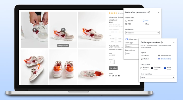
Cloudinary enables an interactive shopping experience, out of the box, with a high-performant, responsive, and customizable product gallery that supports images, videos, 360-degree views, and 3D models.
The initial implementation requires just a few lines of code for embedding on any page and you can then configure it to suit your needs.
Layout
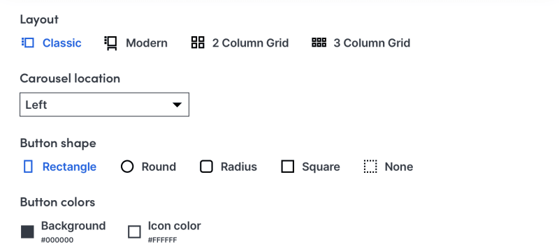
You can customize the layout of the widget by simply selecting between classic or modern variations that include the table of contents or a grid approach for a touch-friendly layout.

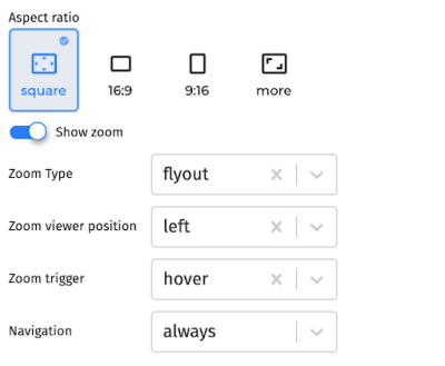
You can also adjust the type of zoom and navigation. The carousel used for indicating the number and sequence of assets can also be customized to include a series of thumbnail images or small indicators.

Customization
The Product Gallery interface is extensively customizable, whether you need to increase the size of thumbnails in the carousel, move the location of the zoom viewer, or implement your own colorization scheme.
Selecting Product Assets
From here on, you can add product images and videos from the media library. It can display images, videos, 360 spin sets, and 3D models, out of the box. You can populate the widget with desired media assets by simply specifying the asset type, public ID, or tag associated with their metadata.
Performance
All the product assets added to this gallery are automatically optimized for faster loading and responsive delivery on any viewport:
- Format selection: automatically selects the most efficient image and video format based on the viewing browser and the asset content.
- Quality compression: automatically adjusts image and video quality to a level that minimizes the file size without any visual degradation.
- DPR adjustment: automatically delivers images and videos with a Device Pixel Ratio that matches the DPR support of the requesting device.
- Dynamic manipulations: adds overlays, badging, and other artistic effects and filters to assets, on the fly for personalization.
- Content-aware cropping: automatically detects the regions of interest to dynamically crop images, without losing focus on important content, for responsive delivery.
Responsive
As your customers choose to shop using a wide range of viewports, from desktops to mobile devices, the Cloudinary Product Gallery is inherently responsive:
- The entire gallery acting as a container of images, videos, and rich media automatically adapts itself to the width of the viewing device and browser.
- All the media assets within the gallery automatically scale up and down to suit optimal responsive breakpoints, balancing the trade-off between dimensions and bandwidth reduction.
Analytics
You can track and report all interactions with the gallery of images and videos into your preferred analytics dashboard, including Google Tag Manager and Google Analytics.
Inspiration
As you think about ways to enhance your product pages, below are a few engaging examples. If you end up buying any of these products, it can be attributed to the effectiveness of the product gallery!
- Classic layout: Allbirds and Sezane
- Modern grid layout: Nike
- Hybrid layout: Everlane and Guess
- 360 spin set: Nixon
Resources
- Play with an interactive demonstration
- Watch a tutorial video
- Read the documentation


