
Developing a library requires a different approach from developing an application. You must consider the use of the library in someone else’s application and design for it. React is well suited for this purpose. And if the library you are creating is an adapter to another library, you can dynamically generate the component's properties definition to ensure they are forward compatible. There is however more than one way to achieve the same goal, with some conventions to follow and others to cautiously not follow. In particular, I chose to use the context function even though it is an experimental feature because it is useful when you don’t know, or can’t dictate, the way your library's components will be utilized.
The React framework
What’s react?
React is a JavaScript library developed by Facebook that specializes in rendering data as HTML and is widely used by websites such as Netflix, Imgur, Airbnb, and of course Facebook.
Why develop a React SDK?
An SDK or library provides a developer access to underlying functionality without exposing the complexity of the implementation. A library is most useful when it exposes the functionality using the syntax, components and methodology of the environment it is deployed in.
In Cloudinary’s case, we already provide a Cloudinary JavaScript library that can be used in any JavaScript based applications. However in order for us to support developers that are using React to create fast and responsive websites, we wanted to provide them with a convenient React library that they could use to deliver media from Cloudinary. In effect, we needed to provide React components that the developer can integrate directly in their application. These components in turn would take advantage of the functionality provided by the Cloudinary Core JavaScript library. The rest of this tutorial demonstrates how I developed our React library. This will not be a comprehensive description of our library but rather a guide that will (hopefully!) help you develop your own ReactJs library.
Basic requirements
Cloudinary provides a service for a cloud based storage, manipulation and delivery of images and other media content. Thus at minimum, a Cloudinary React library would need to deliver media resources from Cloudinary, as well as define transformations on those resources. The library should also allow the developer to configure the Cloudinary service and configure the Cloudinary account (represented by the cloud_name) to deliver resources from.
Thus the scope of version 1.0 of our library is:
- Configuration
- Image tag
- Transformation parameters
I added code samples to accompany this post in our repository. To review the code, issue the following commands:
git clone https://github.com/cloudinary/cloudinary-react
git checkout library-how-to-step-1
You will find a similar command line at the beginning of each section below. Use it to review the code described in that section.
Getting to work
Setting up the project
JavaScript is an implementation of the ECMAScript specifications with support for the different versions of ES differing between browsers and browser versions. As a library developer, you would like your library to be supported in as many clients as possible, and these days, that would imply using ES5 (more).
Yet, while it may be possible to write a React program using plain ES5, React normally utilizes ES6 syntax as well as JSX, packing it all with webpack. ES6 (also known as EcmaScript 6 or ES2015) introduces many new features to JavaScript, including classes and scoped variables. JSX on the other hand, provides a convenient way to include HTML code in JavaScript. When developing a library you can’t always know how it will be utilized. Thus we need to provide developers with sources that can be accessed directly, as well as a compiled JavaScript distribution file that can be imported directly in the browser. In order to utilize these features, several libraries must be included in your project:
- The React libraries.
- Babel - translates ES6 and JSX to the more widely supported ES5.
- Webpack - packing javascript applications, and providing a development server.
- The Cloudinary JavaScript library (duh!).
Babel and Webpack each require a configuration file. You can see an example of the configuration at https://github.com/cloudinary/cloudinary-react/tree/library-how-to-step-1.
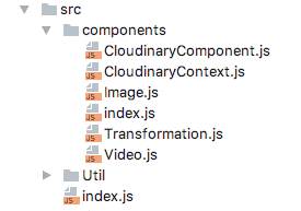
Folder structure
Each component will reside in its own folder. A package.json file is also included in each folder to allow using the “import ‘./folder_name’;” syntax instead of the more verbose “import ‘./folder_name/filename’;” style.

An alternative would be to have one JS file per component. When using this approach you also need to include an index.js file that exports the components.
There are pros and cons to each approach, but I’ll leave that discussion for another day.
Creating the Image component
The first Component we’ll implement will be used to display an image. The image component should:
- Accept configuration parameters.
- Accept transformation parameters.
- Accept an image public ID (the image's unique identifier).
- Render an
<img>tag with a constructed URL to display the image.
Humble beginnings
We will start by defining a simple image component. The component will accept a cloud name, public ID and dimensions, and will then create an <img> tag to render the image.
A React component can be defined as a function or as a class. We’ll define all Cloudinary components as classes. The difference between the function and class approach is discussed here.
import React, {Component, PropTypes} from 'react';
import cloudinary from 'cloudinary-core';

export default class Image extends React.Component {
 constructor(props) {
   super(props);
 }

 render() {
   let cl = cloudinary.Cloudinary.new({cloud_name: this.props.cloudName});
   var {publicId, width, height} = this.props;
   var url = cl.url(publicId, {width, height, crop: "scale"});
   return (
     <img src={url} />
   );
 }
}

Image.propTypes = {
 cloudName: PropTypes.string.isRequired,
 publicId: PropTypes.string.isRequired,
 width: PropTypes.number,
 height: PropTypes.number
};
Image.defaultProps = {};
Our component is simple enough.
It declares 4 properties as well as their type and whether they are required.
The render method, which is invoked whenever the component needs to be rendered, uses the properties values to generate a Cloudinary URL, and returns an <img> tag with that URL.
Seeing is believing
Unlike an application, we can’t simply run our library to see the results. To test it, we’ll create a simple HTML page named “image.html” under the “samples” folder.
<!DOCTYPE html>
<html lang="en">
<head>
   <meta charset="UTF-8">
   <title>Cloudinary Image Component</title>
   <script src="../node_modules/react/dist/react.js"></script>
   <script src="../node_modules/react-dom/dist/react-dom.js"></script>
   <script src="https://unpkg.com/babel-standalone@6.15.0/babel.min.js"></script>
   <script src="../node_modules/cloudinary-core/cloudinary-core-shrinkwrap.js"></script>
   <script src="../dist/cloudinary-react.js" ></script>
</head>
<body>

<div id="root"></div>
<script type="text/babel">
 let Image = cloudinaryReact.Image;
 ReactDOM.render(
         <Image width="400" cloudName="demo" publicId="sample"></Image>,
   document.getElementById('root')
 );

</script>
</body>
</html>
It works!
(Notice that we are using the babel-standalone library in order to translate JSX syntax in the browser!)
Deciding what properties to expose
A React component is affected by two sets of information: the properties and the state. Generally speaking, properties are public and may be set by a parent of the component. State is private and is not accessed outside the component.
A Cloudinary image delivery URL may accept many parameters that affect the resulting image. Furthermore, Cloudinary keeps coming up with new options almost weekly. For these reasons, we want the component to be forward compatible - that is be able to accept new configuration options in the future.
There are two ways to implement the the configuration and transformation options:
- As two properties whose values are a collection of parameters.
- As individual options. The former option has the advantage of strongly typing the signature of the component - we know that there are two properties named, say, options and transformation. In addition, the developer can prepare the options and transformation objects in advance:
<Image options={{cloudName:"demo", publicId:"sample"}} transformation={{width: 100, crop: "crop"}}/>
Or,
let options={publicId: "dog", secure: true};
let transformation={crop: "scale", format: "jpg", width: 300};

<Image options={options} transformation={transformation} ></Image>
The disadvantage is that they encapsulate the actual parameters and thus make the component less readable.
Compare this with the latter option. Here each configuration and transformation option is an individual property of the component:
I think this is much nicer, don’t you?
Back to the Future
git checkout library-how-to-step-3
A React component’s properties must be declared. Property values are checked in development mode and will produce a warning if they are invalid. To keep the definition future-compatible, we need to automatically define all configuration and transformation properties. This is done by listing all configuration and transformation keys from the cloudinary_js library. For simplicity, we define all properties as strings.
let allParams = cloudinary.Configuration.CONFIG_PARAMS.concat(cloudinary.Transformation.PARAM_NAMES);
Image.VALID_OPTIONS = allParams.map(camelCase);
Image.propTypes = typesFrom(Image.VALID_OPTIONS);
This code segment uses two utility functions, provided by the Util module of the Cloudinary Core JavaScript library:
- camelCase - converts a string to CamelCase
- typesFrom creates a properties definition object from an array of property names
Attributes
When designing the component interface (mainly, the properties of the component), you should carefully consider its utilization. For example, the developer may wish to provide attributes for the resulting tags. To allow the developer to explicitly provide the tag attributes, we will use the Transformation.toHtmlAttributes() method. This method collects all the properties that have a name that starts with “html_”, adds additional attributes calculated from the input, and returns them all as a set of HTML attributes that can be assigned to an HTML tag.
The spread operator (...) is required to convert the attributes object to key=value sets for the component.
let attributes = transformation.toHtmlAttributes();
return (
 <img {...attributes} src={url} />
);
Nested components - adding the Transformation component
git checkout library-how-to-step-4
A cloudinary resource can be defined using several transformations which are chained together. We can represent this chain by providing an array of objects to the transformation property. But that brings us back to the complex properties approach which we want to avoid.
<Image cloudName="demo" publicId="sample" width="100" crop="scale" angle="10"
      transformation={[{width: 100, crop: "crop"}, {width: 100, angle: -10, crop: "scale"}]}/>
To reduce this complexity, we introduce a new component: Transformation. This is a virtual component, i.e., it does not render to the DOM/HTML. Instead, it represents a transformation that affects the image component.
<Image cloudName="demo" publicId="sample">
   <Transformation width="100" crop="crop"/>
   <Transformation angle="-10" crop="scale" width="100"/>
</Image>
The Transformation component should not render a DOM node or HTML tag. But its properties should be available to the encapsulating Image component.
Preventing the component from rendering is easy. Simply return null from the render method:
Access to the encapsulated components is done through the children property (this.props.children). React also provides a convenience method to map over the children. You should check the type of the child before using its properties.
let childrenOptions = React.Children.map(this.props.children, child =>{
 if (child.type && child.type.name === "Transformation"){
   return getOptions(child.props);
 } else {
   return {};
 }
});
What next?
So far we created an image component and a transformation component. We figured out a way to declare the properties of the component dynamically to support all the parameters of the underlying cloudinary_js library. We also devised a way for the image component to gather properties from its children.
To complete the CloudinaryReact library we will need to create a video component. When you do this you will quickly realize that your are duplicating code between the components. This can be solved by moving shared code to the Util object, or by introducing a common ancestor class to both the image and video component. The React documentation advises the former method (see here and here), but we preferred the latter, as it produces a cleaner and more modular code. What’s your preference?
We will also need to tie our image components to the browser’s resize event in order to provide responsive behavior - the automatic selection of image size to fit the viewing area.
Another feature that would be useful is the ability to define common configuration parameters for a group of components or the entire page. We chose to use context for this purpose even though the React documentation vehemently advises against it as it is considered to be experimental and may be removed in future releases of React. Instead they suggest using Redux or passing an entire component as a property. This may be right for an application but not for a library. The application the library is used in may not be a redux application. Passing the properties down to the children is also not practical as the components who require the information may not be direct descendants of the parent passing the configuration parameters. On the flip side, using context will require us to provide an alternative solution if the functionality is removed in a future release of React.
All this, however, is beyond the scope of this post. As soon as I get a break from my coding tasks, I’ll post the next post on this subject.
git checkout master
You can review the implementation of these ideas as well as other components in our Cloudinary React library, and of course suggest your solutions in the comments.
Additional Resources: