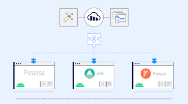
Adding code to display an image in your application is one of the most common tasks for almost every application developer. However, when it comes to Android applications, there is no inbuilt support for any image related tasks, which could be a potential pain when Android developers need to handle loading (and reloading) images into the view, handling the caching and memory issues, and supporting simple UI functionality.

Welcome to the latest edition of the Responsive Images Guide!
In part 1, I laid out the big idea: a responsive image is a variable image – which adjusts itself to fit variable contexts.
In part 2, we looked at the most common way that an image can do exactly that: scaling itself up and down to fit viewports of different sizes and screens with different densities.

In Part 1 of this series, I discussed (rather abstractly) what it means for an image to be “responsive.” In short, a responsive image is a variable image that adapts to fit variable contexts, in order to provide a great experience to users no matter what their screen, browser, network connection, or device may be.
“Responsive.” Where did that term come from, anyways?
In his sea-changing essay, Responsive Web Design, Ethan Marcotte explained:
Recently, an emergent discipline called “responsive architecture” has begun asking how physical spaces can respond to the presence of people passing through them. Through a combination of embedded robotics and tensile materials, architects are experimenting with art installations and wall structures that bend, flex, and expand as crowds approach them. … rather than creating immutable, unchanging spaces … inhabitant and structure can—and should—mutually influence each other.

Note: this article was originally published in Smashing Magazine.
Four years ago, Jason Grigsby asked a surprisingly difficult question: How do you pick responsive images breakpoints? A year later, he had an answer: ideally, we’d set responsive image performance budgets to achieve “sensible jumps in file size”. Cloudinary built a tool that implemented this idea, and the response from the community was universal: “Great! Now – what else can it do?” Today, we have an answer: art direction!

Back in the day, responsive website design wasn't the business imperative that it is now. In fact, just having a functioning website was all that it took to set you apart, and if it had images that loaded correctly within a few minutes, then that was a nice bonus. Needless to say, but I'll say it anyway, those days are long gone.

I'll start by giving it to you straight:
As part of the recent "auto–everything" launch, we introduced two new transformation parameters – dpr_auto and w_auto, which pair the DPR and Width Client Hints with Cloudinary’s existing image resizing and delivery infrastructure, in order to serve up simple, automatic responsive images.

This is a guest post by Eric Portis – a proud member of (and newsletter-writer for) the Responsive Issues Community Group. The RICG formulated, championed, and standardized the new HTML features presented in the article.