 Programmable Media
 Digital Asset Management
Media Library Widget
Last updated: Apr-21-2024
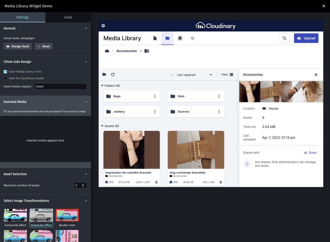
By integrating the Cloudinary Media Library widget into your CMS or any other web application, all your users can easily select images, videos, PDFs, or other stored raw files directly from Cloudinary and insert them in a way that exactly fits your application design, required behavior, and overall workflow.
The integration involves only a few lines of code and provides you (and your users) all the benefits of Cloudinary's responsive Media Library UI with its rich search capabilities and optimized media asset delivery.
- For Enterprise customers, you must have an Assets plan to use the Media Library widget. For any questions, contact your Customer Success Manager or Cloudinary's support team.
- If your account is using the New Console Navigation Experience and the account logging into the Media Library widget has SAML (SSO) login enabled, you must whitelist the domain
console.cloudinary.com. If you need assistance, contact Cloudinary Support. - Cloudinary supports only the documented configuration and the supplied files with the widget. Any direct changes to the widget code and its elements (for example, CSS and JS files) might break its functionality, and will not be supported.
- Every user who accesses the Media Library requires a separate seat license.
Media Library widget features
This JavaScript-based integration includes many configuration options, including:
- Set the Media Library to open as a modal dialog or inline in your application.
- Control whether users can insert one asset at a time or many.
- Set up default transformations to be applied to all selected assets.
This can be useful to ensure usage of consistent size, quality, format, or other optimization settings, adding a logo overlay, or other applying styles to ensure consistency of the media delivered via your application. If the user also defines transformations, the default transformations are applied (chained) to their transformations. - Customize elements of the widget look and feel, such as supplying a custom button class, customizing various button captions, or hiding the Cloudinary logo banner when opening the widget inline in your application.
- Open the Media Library directly to a specified state, such as opening to a specific folder, or opening a specific asset.
- Enable users to seamlessly log in to Cloudinary via your organization's SAML-based SSO provider (premium feature).

How to integrate the widget in your app
Check out the Media Library interactive demo and try out some of the configuration options. Although the demo does not cover every possible option, it generates the required code for implementing the options you select, making for an ideal playground for getting started with widget. To personalize the experience you will be prompted to provide your Cloud Name and API key (or Signup for free).
Integration overview
The following steps summarize the process of integrating the Cloudinary Media Library widget into a page in your application. Click the links for detailed implementation information.
-
Include the required JavaScript - Include Cloudinary's
all.jsfile in the page where you want to open the Media Library. -
Set the configuration options - When you call the method to initialize and/or open the Media Library widget, you pass it a set of configuration options. These options include the mandatory
cloud_nameandapi_keyoptions. Additionally, you can provide a number of optional parameters that control settings such as those described in the introduction above. -
Create your callback function - After a user selects media assets and closes the Media Library, the widget returns a JSON payload that includes the URL(s) of the selected asset(s) as well as other asset data such as file and pixel size, format, asset type (image, video, raw, etc), and more. You should create an
insertHandlercallback function that receives and handles this data to control how the selected assets will be integrated into your page. -
Instantiate and open the Media Library widget instance - Now that you've set up the configuration options, and created the callback function, you pass these to the
createMediaLibraryoropenMediaLibrarymethod, which instantiates, or instantiates and opens, the widget. - Optional. Set up SAML authentication. You can enable (or require) your users to log in to Cloudinary via your SAML-based SSO provider. If your users already log in using SSO for the CMS or web app that will host the Media Library widget, this option can provide a seamless experience.
- Optional. Define the Cloudinary log out policy - You can log the user out of Cloudinary when they log out of your CMS, or at any time, using the Cloudinary logout endpoint.
-
Optional. Add upload event handling - You can register to the Media Library widget's
uploadevent, which is triggered whenever the embedded upload widget triggers an event. -
Optional. Add delete event handling - You can register to the Media Library widget's
deleteevent, which is triggered whenever the user deletes an asset.
1. Include the required JavaScript
Add the following line to the web page where you want to open the Media Library widget:
2. Set the configuration options
When you call the openMediaLibrary() or createMediaLibrary() method, you pass it a set of configuration options. These options include the mandatory cloud_name and api_key options. Additionally, you can include a variety of optional settings that control the behavior and look and feel of the widget, as shown below.
You can also optionally adjust the values of the Media Library behavior options shown below when re-opening the widget using the show() method.
| Option | Description | Default Value |
|---|---|---|
| Authentication | ||
| cloud_name | Required. String. The cloud_name of the product environment to access. | |
| api_key | Required. String. The product environment API key. | |
| username |
String. The user name to use when accessing Cloudinary. When this value is provided, if the user is not already logged in, the Cloudinary login screen opens with the specified user name already displayed. When not provided, the user can manually enter any user name and corresponding password in the Cloudinary login screen. |
None |
| use_saml |
Boolean. Whether to perform automatic SSO login via SAML for the specified username. This parameter is only needed if the 'Enforce SAML login' option is disabled for your account. |
False |
| Analytics | Note: Adding analytics is a requirement for becoming a Cloudinary integration partner. | |
| integration | Object. Enables seamless analytics tracking within the widget for analyzing usage patterns and performance metrics. For more information, see How to add analytics to your integration. | |
| Client-side | ||
| button_caption |
String. The caption text to display on the button in the page that opens the Media Library. Applied when the |
Open Media Library |
| button_class |
String. The class to use for the button in the page that opens the Media Library. Applied when the |
None (Uses a default HTML button element.) |
| inline_container | String or HTMLElement. The selector string or HTMLElement that will contain the Media Library widget. Include this parameter if you want the Media Library to open as an embedded element in your web page.When opened as modal (default), the Media Library blocks access to your application page. When opened inline, your application is not blocked. | None (opens as a modal dialog box) |
| insert_caption | String. The caption text to display on the Insert button. If you want to use an external mechanism for the insert operation, you can set this option to null or an empty string to hide the built-in insert button entirely. | Insert |
| remove_header |
Boolean. Whether to remove the blue top banner when opening the widget inline. Only relevant when inline_container also has a value set. When opening the widget as a modal dialog box, this parameter is ignored. |
False |
| z_index |
Integer. Sets the CSS stack order of the Media Library element. Relevant when working with the Media Library widget as a modal dialog |
99999 (top) |
| Media Library behavior |
Note: These options can also be adjusted using the show() method. |
|
| default_transformations |
Object[][]. A transformation object containing one or more transformations that you want to apply to every inserted media asset. each transformation can include multiple chained components if needed. This is defined in the same way you would define an eager transformation. For example: [[{quality: "auto"},{fetch_format: "auto"}]]Your default transformation can also be a complex, chained transformation object that controls the size and quality, adds overlays, and more. Additionally, it can contain more than one transformation definition. In that case, multiple derived images are created for each selected asset and included in the response.
Notes:
|
None |
| max_files | Max number of media assets that can be added during a single session. Relevant when multiple=true. |
20 |
| multiple | Boolean. Whether to allow users to select multiple images from the Media Library asset grid. | True |
| Custom show() options | These options are relevant only for the show() method. |
|
| asset |
Object. Instructs the widget to open directly to the Manage page of the Media library with a specified asset. The unique identifier of the asset to open is specified with an asset object. The asset object can either separately define the resource_type, type, and public_id, or as a single resource_id identifier. For example: {asset: {resource_type: "image", type: "upload", public_id: "sample"}} OR {asset: {resource_id: "image/upload/sample"}}
|
None |
| collection |
Object. Instructs the widget to open in collections view:
|
None |
| search |
Object. Instructs the widget to open in search view:
|
None |
| folder |
Object. Instructs the widget to open in browse mode, displaying the contents of the specified folder, and optionally filtered to a specific asset type. These options are specified with a folder object as follows: {folder: {path: "folder", resource_type: "video"}}
|
Root (Home) folder, All asset types |
| transformation |
Object. Instructs the widget to open directly to the Edit page of the Media library with a specified asset, and with a specified transformation already applied. The asset and transformation are specified in URL format with a transformation object as follows: {transformation:{url: "https://res.cloudinary.com/demo/image/upload/c_scale,w_123/a_45/v1653893768/cld-sample-3.jpg"}}
|
None |
Sample configuration options definition
The configuration below displays a custom designed button (of class myBtn) with the label Insert Images in the CMS or Web app page. When the button is clicked, the Media Library widget will open as a modal dialog with alex as the logged in user. For each image selected, two derived images will be generated, one that delivers the original image, but with q_auto and f_auto transformations applied, and another that delivers the image as a small, circular image, using g_auto to ensure the most important part of the image remains in the crop.
3. Create your callback function

After a user selects media assets to insert and closes the Media Library, the widget returns a JSON payload that includes the URL(s) of the selected asset(s), any derived assets based on specified or default transformations, as well as other asset data such as file dimensions, byte size, format, asset type (image, video, raw, etc), and more. You should create an insertHandler callback function that receives and handles this data to control how the selected assets will be integrated into your page.
For example: function insertHandler(data){...}
The returned data consists of an array of Objects - one for each inserted asset. Each object includes the following attributes (shown here in alphabetical order):
-
bytes: number -
context: Object[] -
created_at: string -
derived: Object[] -
format: string -
height: number -
public_id: string -
resource_type: string -
secure_url: string -
tags: string[] -
type:"upload" -
url: string -
version: number -
width: number - [
duration: number] - for video assets only
Sample JSON response for a transformed image
The following shows an example of the JSON data returned after a user inserted an image with transformations applied. Note that data includes the URLs (HTTP and HTTPS versions) of the original image as well as the URLs of the derived (transformed) image.
Sample JSON response for an original video
The following shows an example of the JSON data returned after a user selected a video asset.
4. Instantiate and open the Media Library widget
Now that you've set up the configuration options, and created the callback function, you pass these to one of the instantiation methods. Both methods instantiate the widget.
- openMediaLibrary - Instantiates the widget and then opens it. If the user is not yet logged into Cloudinary (either directly or via SSO), a link prompts the user to log in. After successful login, the widget opens and displays the available assets.
- createMediaLibrary - Instantiates the widget, but does not open it. This can be useful if you want to activate the instantiation process in the background so that the Media Library will open more quickly for your users when requested. You can explicitly open or close the media widget using the show() and hide() toggle methods.
Syntax
- openMediaLibrary(options, callback, [:btnPlaceholder])
- createMediaLibrary(options, callback, [:btnPlaceholder])
Parameters
-
options- The configuration options to apply to your initial Media Library instance. If you use the show() and hide() toggle methods, you can optionally adjust some of these settings each time the widget opens. -
callback- The callback function that determines how to handle the selected (returned) media assets. -
btnPlaceholder- Optional. An HTMLElement or selector in your web page that will be replaced with a new button that toggles the Media Library instance open and closed. You can configure the appearance and text of this button by defining thebutton_classandbutton_captionconfiguration options.
Example
Show or hide the media library
After the Media Library has been instantiated, you can use the show() and hide() methods to open and close the widget in your application.
-
window.ml.show( [options] ) - If you want to adjust any of the Media Library behavior options that were defined when you instantiated the widget, you can optionally pass a new
optionsobject with the settings you want to change for this particular show session.For example, if you want to control the total number of assets a user can insert during a single operation in your CMS application, then if the user inserts a few items, closes the widget, and then reopens it, you might want to adjust the
max_filesvalue according to the new remaining amount.When calling
show(), if the user is not yet logged into Cloudinary (either directly or via SSO), the user is prompted to log in. window.ml.hide() - When you hide the widget, any adjusted options that were passed in the
show()command are forgotten, and the settings revert to those set in the initial instantiation.
Show and hide callback functions
In addition to the required insertHandler callback function, you can also add optional callback functions that will run when the Media Library widget is displayed or hidden:
- The
showHandlercallback function runs when the widget is displayed, e.g.:{showHandler: () => {console.log("show")}} - The
hideHandlercallback function runs when the widget is hidden, e.g.:{hideHandler: () => {console.log("hide")}}
For example:
5. Optional. Set up SAML authentication
If your CMS or web app users already log in using SSO, you can also set up SSO login for Cloudinary so that your users can enjoy a seamless experience.
- Without this option configured, your users will need to separately log into Cloudinary when the widget opens, unless they have previously logged in via the Cloudinary Console.
- SAML authentication is a premium Cloudinary feature. Contact us to enable this feature for your account.
After the feature has been made available for your account, you (as a Cloudinary account admin) activate SAML authentication for your users by entering your provider's SAML metadata URL in the SAML Login option in the Account Security page of the Console Settings. You can choose to either allow or enforce SSO login for your users.
To automatically login a user based on an existing SSO session, you must configure your IDP security settings to allow IFrame embedding, and also provide the following configuration params:
-
use_samlset to true (only needed if the 'Enforce SAML login' option is disabled for your account). -
usernamewith the user name to use when accessing the account.
6. Optional. Define the Cloudinary log out policy
You can log the user out of Cloudinary when they log out of your application (or at any other point during their application session) by calling the Cloudinary logout endpoint: https://cloudinary.com/users/logout
7. Optional. Add upload event handling
You can register to the Media Library widget's upload event, which is triggered whenever the embedded upload widget triggers an event, with details of the event triggered. Use the on method with an initialized widget to register to the upload event. For example, to register the initialized ml Media Library widget to the upload event:
For a full listing of events triggered by the embedded upload widget, see the Events section in the Upload Widget API reference.
8. Optional. Add delete event handling
You can register to the Media Library widget's delete event, which is triggered whenever a user deletes an asset, and includes all details of the file(s) deleted. This can be useful if you are storing assets in your model, and need to know if a user may have deleted an uploaded asset (for example, they uploaded the wrong image).
Examples
Example 1
The following example instantiates the Media Library widget as a modal dialog and prepares it for John Doe to log in and access the my_company Cloudinary product environment. (The login will either be handled by SAML authentication or manual login.) The configuration includes a customized button class and button text that will replace the open-btn HTML element in the CMS page. The data for the selected asset is displayed in the console log.
Example 2
The following example instantiates the Media Library widget and prepares it for Alice Wonderlin to log in and access the my_company product environment, and then opens the widget as a modal dialog. No button is created this time and the user can select up to 8 media assets, with the data for each of the selected assets displayed in the console log.
Code sandbox
The following code sandbox shows you how to implement the Media Library widget in HTML without using an iframe:
Error
Rate this page:
