tl;dr;
Cloudinary conducted a workshop at React Summit 2021 to highlight the effect of media performance on websites by correlating it with Google’s Core Web Vitals and other performance measurements. Also presented were typical optimization techniques along with code samples. Here are the recording and the slides.
React Summit “is an annual conference on all things React, gathering thousands of front-end and full-stack engineers from around the world.” This year, Marissa, Pramod, and I presented at React Summit on behalf of Cloudinary. Our goal was to build on the foundation that media can help drive engagement and conversions on websites and that, if not optimized, media often causes poor user experience and hurts business revenue. Given that I’d already introduced this concept in my Smashing Magazine article How To Boost Media Performance On A Budget, our workshop focused on showcasing practical optimization steps through the React SDK.
Below are four of the common themes we addressed. Read on for the background and the solutions.
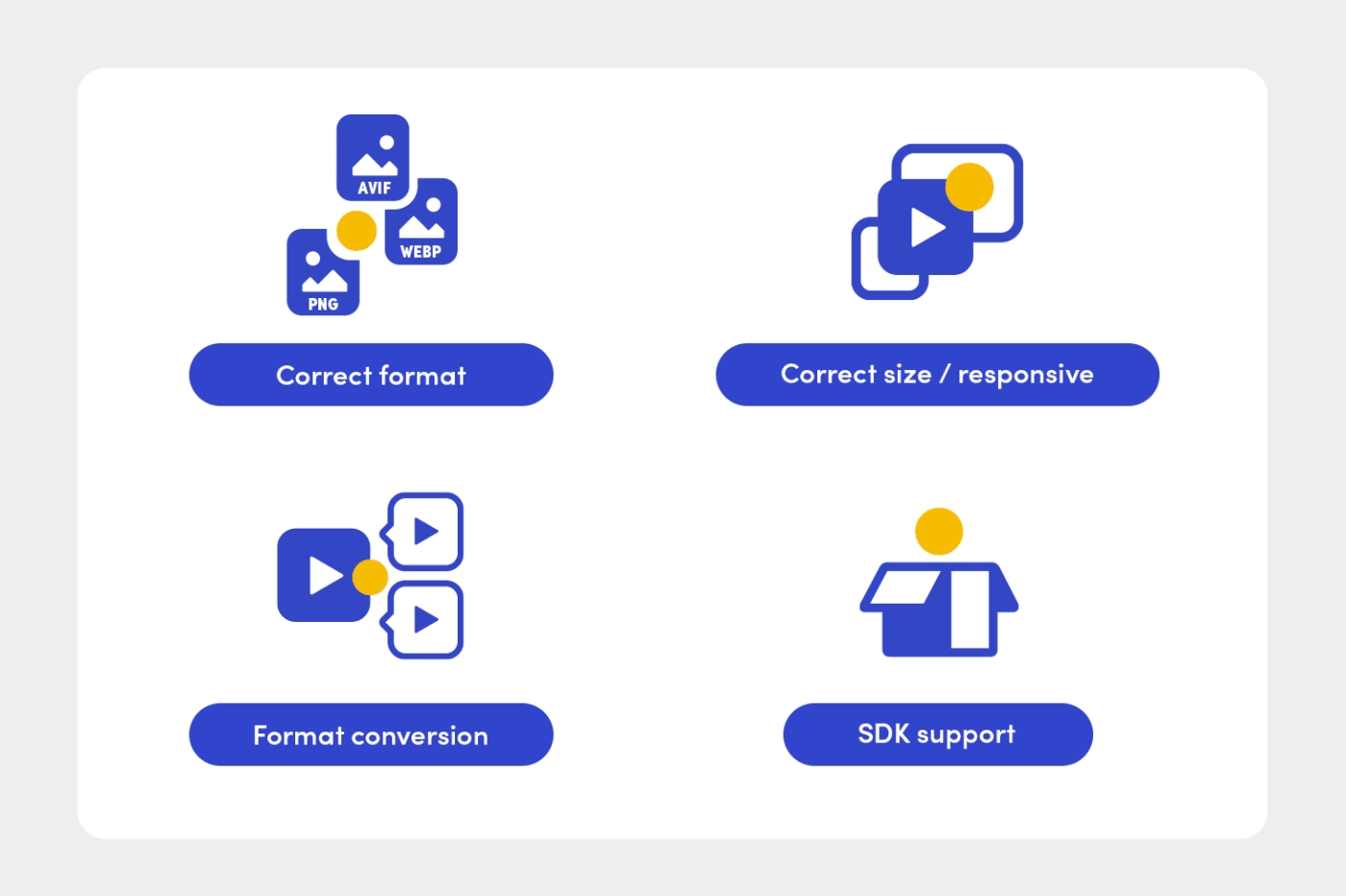
Why Optimize?
The primary focus of developers is on building and delivering functionalities according to the project schedule. In many cases, media optimization takes a back seat in the face of other priorities. Yet, media is increasingly contributing to the overall performance metrics that are being used as a ranking factor for search results. In particular, Google's new Core Web Vitals (CWVs) comprise three performance metrics:
- Largest Contentful Paint (LCP) measures loading performance.
- First Input Delay (FID) measures interactivity.
- Cumulative Layout Stability (CLS) measures visual stability.
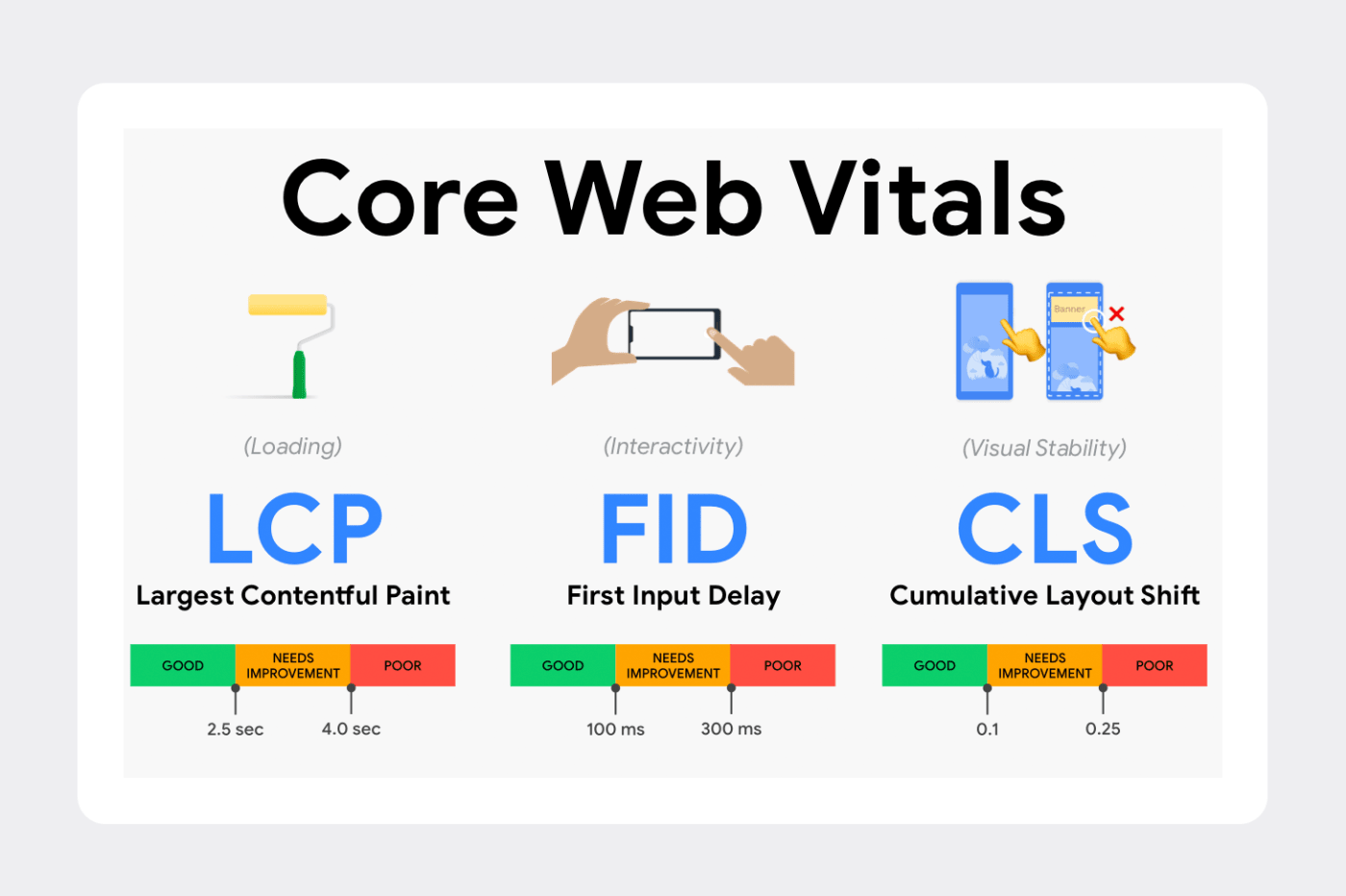
On most media-heavy sites like e-commerce, news articles, and blog posts, LCP might be the hero image or even a video. For example, in this test for the e-commerce site Rent the Runway, the LCP is a video:
<video class="rent-my-style__video" id="rent-my-style__video" preload="auto" loop="" autoplay="" poster="https://cdn.rtrcdn.com/assets/imgs/031721_HP_hero.jpg">
If the poster image or video is suboptimal, the page would be slow to load, resulting in a janky user experience and a lower Google Lighthouse score. Similarly, when combined with an HTML layout that misses the aspect ratio for images, suboptimal images could cause shifts—a phenomenon that frustrates users in addition to lowering the Lighthouse score.
Thus, not only is media optimization important, but it’s also an integral part of the development and build process. That was a key point highlighted at our workshop.
What and How to Optimize?
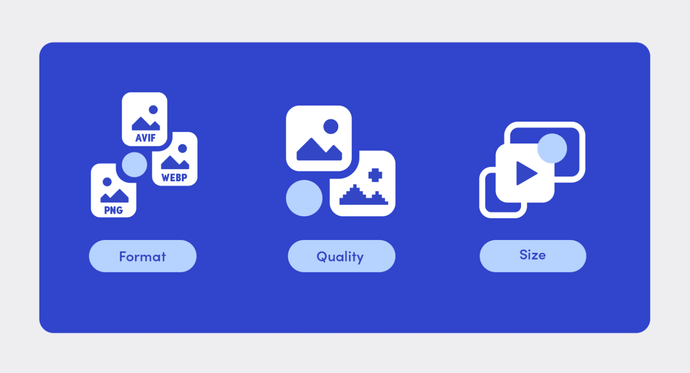
Optimization of media can be broadly classified into three main categories: format, quality, and size.
Format
Lara Hogan, formerly an engineering manager at Etsy, authored an excellent article in March 2015 titled Image Formats (The Nerdy Parts) with details of the various image formats and their common usage.
Over the six years since then, newer formats like AVIF and JPEG-XL have been introduced. With their tight schedules, developers are hard pressed to keep up with the changing landscape. Help is at hand, however: by leveraging Cloudinary's automatic-format (f_auto) mechanism for both images and videos, developers can offload to Cloudinary the task of determining the right format, saving bytes by an order of magnitude.
Quality
You can compress media resources by reducing their quality. For example, a general rule tools like WebPageTest apply is to lower the quality of a JPEG to 80. However, you can achieve higher compression levels by using perceptual metrics like SIMULACRA, which identify the correct lossy-compression level so that humans cannot perceive the artifacts in the images or videos. With Cloudinary's automatic-quality (q_auto) feature, you can ensure that your media is automatically and compressed just right for the most byte savings.
By combining both f_auto and q_auto, you can deliver the perfectly compressed image or video in the format that best suits your end-user's device or browser.
Size
It’s better to resize images or videos for the right dimension on the server side than to download them first and then resize them for display on the browser. You can display such dynamically generated images by using responsive elements like HTML5’s image srcset attribute and <picture> tag, as well as CSS media queries.
You can resize media in multiple ways based on your use case, for example:
- For a standardized image size, say, on the category or product page of an e-commerce site, you could resize to a fixed dimension with the
w_(width) andh_(height) parameters. Alternatively, you could set up named transformations. - For a responsive layout, you could implement responsive images by embedding URLs or with JavaScript.
For more details, see Eric Portis’s superb series on responsive images, complete with insights on how to architect the right methodology.
Delivery
Finally, be sure to deliver media assets as fast as possible with the least amount of latency through a content delivery network (CDN). To achieve optimal efficiency, CDNs can cache content closer to the end-user’s location and avoid repeated requests to your data center or cloud.
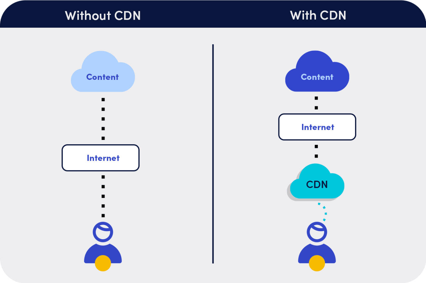
With Cloudinary, you can quickly access resources for delivery through multi-CDNs—a tremendous convenience and time-saver.
Why Not Try It Out Yourself?
Our workshop covered many concepts along with a simple project that I’d put together, which aggregates all the aspects of media optimization. Give the project a try yourself (see below).
Objective
Assume that you are the owner of an e-commerce store that sells T-shirts. However, the app, written in React, has media-optimization issues. To fix them, do the followingY:
- Take a baseline measurement of your site’s performance and CWVs.
- Identify the areas for improvement.
- Implement a fix with Cloudinary's React SDK.
- Measure the performance and gains in CWVs.
Code Samples
Here’s the code:
You could start by measuring the baseline on WebPageTest and enabling the Lighthouse score. Alternatively, jump ahead, as in this example:
Here's the postoptimization measurement on WebPageTest.
This video shows the homepage loading before and after optimization:
What Do You Think?
Besides the techniques described above, we also discussed other optimization approaches offered by Cloudinary, e.g, Media Optimizer, the Product Gallery widget, and the upload widget. Additionally, we described the options for handling responsive media.
Has this topic piqued your interest? If so, do listen to the recording of our workshop at React Summit 2021 and send us your thoughts.


