
Perhaps some of you readers that have been around for a while remember our add-ons launch 2 years back, when we introduced a number of third party image processing products, fully integrated into the Cloudinary image management pipeline. Since then our add-ons marketplace has grown, both in our offerings and in usage. We now have 11 add-ons offering various capabilities and improvements.

Updated (October 2019):
Since this post was written, a new feature has been added that lets you export a day's data into a .CSV file. Selecting the "Export to CSV" option will generate an email where you can download the file and import it into your favorite spreadsheet software, such as Microsoft Excel, for viewing and filtering.
Robert Moseley is Cloudinary’s Senior Solutions Engineer, a technology and use-case expert with over a decade of experience in analytics, optimization, and personalization. Here he writes about his experience and reflections from the field.

This is a guest post by Eric Portis – a proud member of (and newsletter-writer for) the Responsive Issues Community Group. The RICG formulated, championed, and standardized the new HTML features presented in the article.
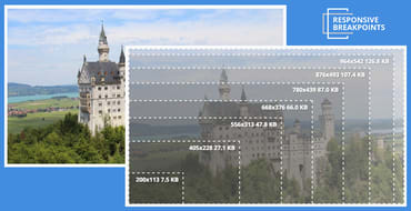
The number of different devices available and their potential screen resolutions keep increasing, and to support this wide range of resolutions and devices, responsive website design is now the standard. A website's markup must adapt itself to look perfect on all the different devices and in various resolutions, pixel densities and mobile device orientations. Managing, transforming and delivering images, is one of the main challenges of breakpoints for responsive design that web developers face.
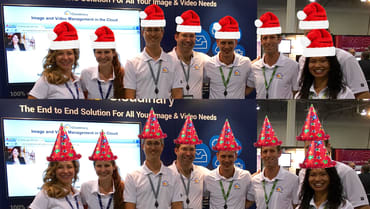
As the end of 2015 approaches, we wanted to share a quick summary of Cloudinary’s accomplishment this year and some of our plans for next year. We couldn't possibly do this without including an image transformation example! That's our hat trick in the title :-)
It can be quite a challenge to graphically design a website or mobile application that displays images in very precise shapes and orientations. Product customization can take the form of warping 2D pictures to have a 3D perspective, placing images in precise shapes or overlaying images in specific locations within another image, for example: overlaying an image over the screen of a smartphone.

Content Optimization and Personalization programs can deliver tremendous ROI to an organization but tend to be very resource intensive, requiring developers to build the code for alternate experiences and creative folks to generate the content. Many of the content optimization/personalization tools out there today (Maxymiser, Optimizely, Adobe Target, Ensighten etc.) have created WYSIWYG (What You See Is What You Get) editors to help relieve the code/development bottleneck but the creative bottleneck stubbornly remains.
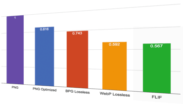
A fresh new lossless image format has recently been introduced. It is called FLIF, which is an acronym for Free Lossless Image Format. According to the creators of FLIF, it is supposed to significantly outperform the other image formats that have lossless modes, such as PNG, WebP and the new BPG format.

If you have an application that allows users to upload their own photos, it can be very useful to be able to organize these photos according to their content. This will allow you to categorize the content for displaying to all your users and make your image library searchable. Furthermore, you can also learn more about your users according to the content they upload and find different trends of what people care about. Other added benefits can also include the ability to display matching content to your users according to their interests or even match them with other users that share similar interests.